
Beyond Charts: Top Think-cell Alternatives with AI
Let’s be honest, Think-cell has long been the sharpest tool in the slide-deck shed when it comes to turning Excel data into impressive charts. It’s the go-to plugin for consultants who don’t flinch at 100-slide decks and analysts who live inside PowerPoint. But even the most trusted tools can start to feel… well, a bit 2005.
In 2025, presentation needs have evolved. Teams are moving faster, content is coming from everywhere (emails, meetings, PDFs, you name it), and AI isn’t just helping—it’s doing. Whether you’re building a pitch, reporting KPIs, or just trying to explain a complex idea without turning it into a full-blown TED Talk, the game has changed.
That’s where this list comes in.
We’ve rounded up the top Think-cell alternatives with AI, tools that go beyond classic chart automation and offer smart data visualization, often in seconds. Some live inside PowerPoint, some reinvent it entirely, and yes—some will even write your slides while you sip your coffee.
In an attempt to save you from drowning in overwhelming user reviews, we’ll walk you through how each AI tool works—and what you actually get when you hit “subscribe.”
But first, let’s see what it’s like to work with Think-cell.
A quick look at Think-cell
If you’ve ever seen a consultant build a horizontal waterfall chart at the speed of light, chances are they were using Think-cell. It’s a PowerPoint add-in built for professionals who live and breathe data-driven presentations—especially in finance, consulting, and corporate strategy.
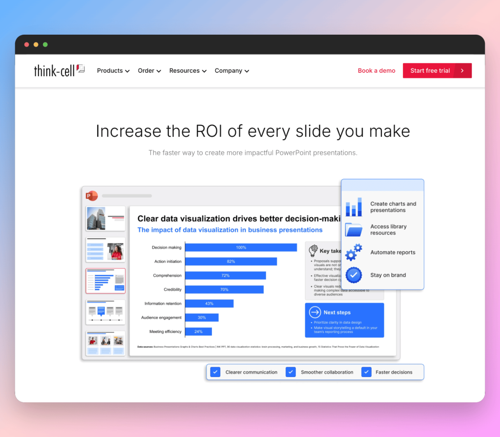
Think-cell shines in turning raw Excel data into clean, boardroom-ready charts like Gantt, Mekko, or Marimekko with just a few clicks. It also handles agenda slides, layout tweaks, and automation that would normally take hours. No design flair, no storytelling—just brutal efficiency.
But here’s the catch: it’s powerful, not flexible. It assumes you already know what you want to say and just need to make it look tidy. In the age of AI, that feels a little… hands-off.
That’s why the tools below are worth exploring—because in 2025, many of us need more than just chart automation. We need insight, speed, and a little creative lift, too.
How we evaluated our top Think-cell alternatives with AI
We didn’t just pick tools that make charts—we looked for platforms that reflect how teams actually work in 2025: fast-moving, collaborative, and AI-augmented. Each tool on this list was selected based on four key criteria:
- AI Assistance: Does it generate or enhance charts, slides, or insights using AI? We’re looking for more than templates—we want tools that think with you.
- Speed & Workflow: Can it reduce the time from data to visual? Does it eliminate unnecessary steps or context-switching?
- Charting Power: How robust is its chart support? Can it handle simple bar graphs and complex waterfall or Gantt charts alike?
- Integration & Collaboration: Does it work with PowerPoint or offer a strong alternative? Can teams collaborate in real-time?
We also added quick-reference tiers for each tool (like “Best for speed” or “Best for theme-matching”) to help you find what fits your workflow best—whether you’re building slides solo or working in a shared workspace.
| Tool | PowerPoint Integration | AI Strength | Chart Depth | Real-Time Collab |
| Think-cell | Native Add-in | Basic | Very High | No |
| Power BI | Export Only | Very Strong | Exceptional | Yes |
| Pageon AI | Export Only | Strong | Moderate | Yes |
| ChatGPT ADA | Manual Image Export | Exceptional | High | No |
| PowerDrill AI | Export Only | Strong | High | Yes |
| ChartGPT | Export Only | Moderate | Basic | No |
| SlideSpeak | Export Only | Strong | Moderate | Yes |
Now, let’s take a look at the top AI charting tools competing with Think-cell.
#1: Power BI
Excels at: Real-time dashboards & deep data exploration
Strengths: AI-driven analysis, live dataset integration
Weaknesses: Requires a learning curve; not ideal for inline slide editing
Integration with PowerPoint: Indirect (export visuals)
Real-time collaboration: Yes (via shared dashboards & Microsoft Teams)
If Think-cell is your go-to for slick charts inside PowerPoint, Power BI flips the script entirely. It’s a powerhouse platform built for real-time data analysis, automated visualizations, and dynamic dashboards—a full business intelligence suite, not just a chart tool.
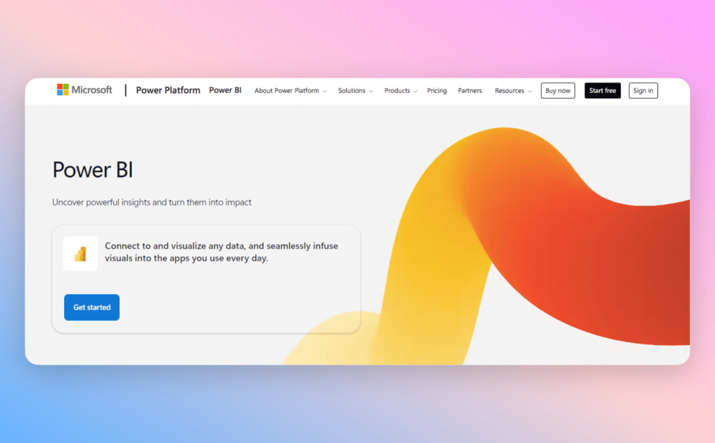
Tailored for analysts and decision-makers navigating fast-moving business landscapes, Power BI transforms static Excel sheets into interactive dashboards. It supports a hefty lineup of advanced chart types—from bar and line to treemaps, waterfalls, KPIs, funnels, and heatmaps—perfect for deep data exploration, not just pretty presentations.
While Power BI doesn’t plug directly into PowerPoint like Think-cell, you can export visuals or embed them in decks and team workspaces. So, it’s not the best fit for quick in-slide edits, but when you need scale, depth, and seamless team collaboration in real time, it’s a heavyweight contender.
Best for:
- Data teams, analysts, and decision-makers who need more than just “pretty” charts
- Mid-size businesses to enterprises with large or frequently changing datasets
- Professionals who rely on Excel but want to unlock automated, AI-powered visualizations
How to Visualize Your Data with Power BI
- Import your data
Load data from Excel, CSV, or live sources into Power BI. It auto-detects tables and shows a preview for easy selection. - Clean and prep
Use Power Query to remove errors, change data types, or create calculated fields—ensuring your visuals reflect clean data. - Pick your visuals
Choose from bar charts, pie charts, maps, and more. Power BI suggests visuals based on your selected fields. - Customize and explore
Add filters, tooltips, and slicers. Use AI tools like Key Influencers or ask natural-language questions with the Q&A visual
- Share and embed
Publish to Power BI Service, export to PowerPoint, or embed dashboards in Teams or SharePoint for real-time collaboration.
Curious to learn more? Take a closer look here.
#2: Pageon AI
Excels at: Narrative-driven presentations & ease of use
Strengths: Conversational AI, narrative generation, simplicity
Weaknesses: Limited chart variety, lacks native PowerPoint integration
Integration with PowerPoint: Export-based (PPT/PDF or shareable links)
Real-time collaboration: Yes (via shared links and live editing)
Next up on our list of top Think-cell alternatives with AI is Pageon AI. While Think-cell shines with structured charts for the seasoned pros, Pageon AI takes a fresh approach—designed for those who want clear presentations without the headache. Just upload your Excel or CSV files, toss in a simple AI prompt, and watch it transform your data into smart narratives and charts.
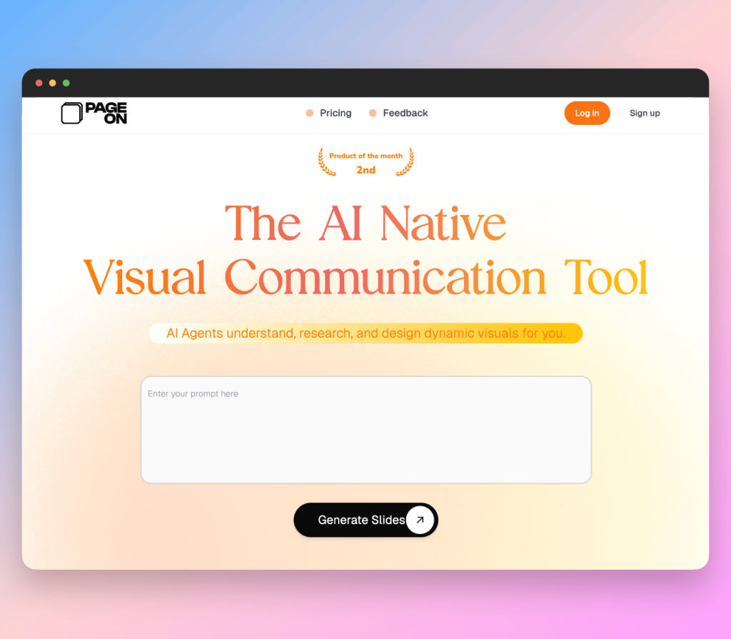
What really makes Pageon stand out is its natural language magic. Ask something like, “What are our top-performing regions?” and it instantly serves up bar, line, and pie charts, plus neat summaries and layout tips. It might not tackle complex visuals like Mekko or waterfall charts, but its straightforwardness is exactly where it scores.
Instead of embedding charts directly into PowerPoint, Pageon operates as a standalone workspace—preview your AI-crafted slides, tweak as needed, then export to PPT or PDF. It’s all about fast, clear storytelling without drowning in detail.
Plus, with real-time collaboration built in, teams can review, edit, and comment through shared links—perfect for marketing, business, or agile squads where iteration never sleeps.
Best for:
- Business teams, analysts, and marketers who want to skip manual slide building
- Mid-size companies that work heavily in Excel or CSV-based reporting
- Professionals looking for an intuitive, AI-first tool that builds a narrative around data
How to Visualize Your Data with Pageon AI
- Upload your Excel or CSV file:
Start by importing your dataset. Pageon automatically reads your tables and identifies patterns or trends within seconds. - Prompt the AI in plain English:
Ask questions like “What are the top-performing products by revenue?” or “Summarize the Q1 customer growth.” The AI will choose the right chart type and generate supporting text based on your data. - Preview the output:
Pageon suggests a clean slide layout with visuals and concise takeaways. You can tweak chart styles, titles, or accompanying commentary before finalizing. - Refine or collaborate:
You can adjust content, change visual themes, or share with your team to review, making it ideal for agile methodologies and faster review cycles. - Export or share your report:
Once ready, export your slides to PowerPoint or PDF, or generate a shareable link for easy collaboration across teams.
Pageon AI delivers a fresh take on data-driven decisions, offering both simplicity and advanced functionality in a single package. If you’re looking for a smart Think-Cell competitor that can turn numbers into narrative, it’s worth a closer look.
Like this Think-cell alternative with AI? Then learn more!
#3: ChatGPT Advanced Data Analysis
Excels at: Flexibility and custom insights
Strengths: Deep exploration, custom charting, natural language input
Weaknesses: Requires comfort with prompt-based interaction
Integration with PowerPoint: Indirect (export as images)
Real-time collaboration: No (currently single-user interface)
ChatGPT Advanced Data Analysis (formerly Code Interpreter) takes AI-powered data work up a notch. Rather than handing you templates or ready-made charts, it lets you upload Excel files and steer the analysis with natural language prompts like, “Build a pivot table of sales by region,” or “Compare Q1 vs Q2 growth.”
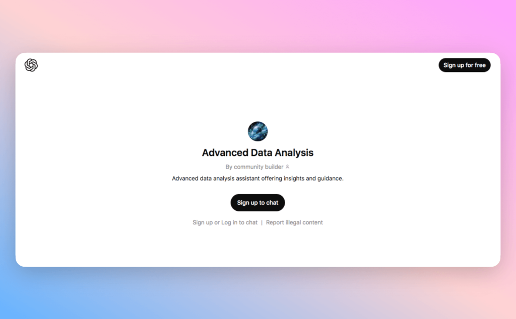
It supports a solid lineup of chart types—bar, line, pie, histogram, scatter, box plot, area charts—and can crunch descriptive stats, spot correlations, or segment data on the fly. It’s less about flashy visuals and more about digging for insights.
Unlike Think-cell or Power BI, ChatGPT ADA doesn’t nestle inside your slides—it’s more like an on-demand data analyst in chat form. You get visuals as downloadable images, then manually drop them into PowerPoint or reports. Sure, it adds a step, but it unlocks a flexibility that most native slide tools just can’t match.
There’s no real-time collaboration yet—each session is a private, one-on-one affair. But for analysts or teams craving deep dives and custom data stories, it’s a standout Think-cell alternative when off-the-shelf templates just won’t cut it.
Best for:
- Data analysts and professionals seeking custom, AI-assisted chart creation
- Teams needing advanced, on-demand data exploration without switching tools
- Users are comfortable interacting via text prompts and wanting tailored, detailed output
How to Visualize Your Data with ChatGPT Advanced Data Analysis
- Upload your Excel file: Start by importing your data file into ChatGPT Advanced Data Analysis.
- Describe your visualization needs: Use plain English prompts like “Create a bar chart showing monthly sales” or “Summarize customer growth by region.” The AI will interpret your request and pick the best chart type.
- Preview and refine: Review the generated chart and data summary. Ask follow-up questions to adjust or expand the visualization as needed.
- Export your visuals: Download charts as images for easy insertion into presentations or reports, since there’s no direct PowerPoint integration yet.
Curious to explore how ChatGPT can enhance your data storytelling? Learn more!
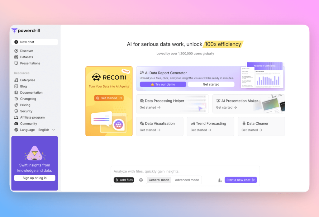
#4: PowerDrill AI
Excels at: Large-scale Excel reporting
Strengths: Trend detection, Excel integration, chart depth
Weaknesses: Cloud-only; requires subscription
Integration with PowerPoint: Export-based with enhanced formatting
Real-time collaboration: Yes (supports shared dashboards and editing)
PowerDrill AI makes our top Think-cell alternatives list, and for good reason. At its core, it’s a cloud-based visualization platform built for business users and data analysts wrestling with hefty, structured datasets. It leans on AI to recommend charts, parse natural language, and slide seamlessly into your Excel workflow.
Just upload your workbook or hook up live data sources, and PowerDrill’s AI will start whispering chart ideas and summaries in your ear. It handles a robust lineup of chart types—bar, line, pie, scatter, waterfall, area, stacked column—perfect for those Think-cell-style technical visuals.
Where PowerDrill really shines? Its smart trend detection and interactive exploration. You can drill down into data points, filter like a pro, or zero in on specific time segments without ever leaving the platform. While it doesn’t do inline slide editing like Think-cell, its PPT and PDF exports come presentation-ready, saving you from the dreaded manual tweaks.
And collaboration? PowerDrill’s got that covered too. Teams can co-edit visuals, drop feedback, and present live dashboards straight from the platform—ideal for those data-heavy workflows that crave both clarity and control.
Best for:
- Data analysts and business intelligence professionals needing in-depth, interactive charts
- Mid-to-large organizations managing large Excel datasets for regular reporting
- Users who value AI assistance in uncovering insights and enhancing financial charts
How to Visualize Your Data with PowerDrill AI
- Connect your Excel data:
Import your workbook or link live Excel files directly into PowerDrill AI for real-time updates. - Let AI analyze your dataset:
PowerDrill’s AI engine scans your data, recommends chart types, and flags important trends or outliers. - Customize your charts:
Modify chart styles, add filters, or drill down into details for specific segments or time periods. - Share or export your visuals:
Export charts to PowerPoint or PDF, or use the interactive dashboard for live presentations and team collaboration.
Curious to explore PowerDrill AI further? Discover more here.
#5: ChartGPT
Best for: Fast, casual visual creation via prompt
Strengths: Conversational UI, quick export, low learning curve
Weaknesses: No advanced charting or direct integration
Integration with PowerPoint: Image/PDF export only
Real-time collaboration: No (currently solo use)
ChartGPT strips chart creation down to the bare essentials: upload your spreadsheet, say what you want, and voilà—an AI-crafted visual appears in seconds. Think of it as the express lane from data to dazzling chart, perfect for those who’d rather skip the fiddly chart editor.
It covers all the essentials—bar, line, pie, scatter, histogram, and stacked columns—focusing on clean, no-nonsense visuals over flashy customization. Unlike Think-cell’s buttoned-up, structure-heavy approach, ChartGPT is for folks who want quick wins without wrestling with complexity.
Everything happens right in your browser—upload your Excel file, type something like “Show customer growth over time,” and watch the AI serve up the perfect chart. No direct PowerPoint integration yet, but you can download your visuals as images or PDFs, ready to pop into any slide or doc.
No real-time collaboration yet, so teamwork happens after export. But for solo pros or speed demons, ChartGPT delivers the simplicity Think-cell sometimes lacks—like a shot of espresso for your data viz routine.
Best for:
- Professionals who prefer conversational AI for on-demand data visualization
- Users needing quick chart creation without complex software skills
- Teams wanting fast, exportable visual insights from Excel datasets
How to Visualize Your Data with ChartGPT
- Upload your Excel or CSV file:
Begin by importing your data into ChartGPT. The AI scans your dataset and identifies key variables. - Use natural language prompts:
Ask questions like “Show me the sales trend over the last year” or “Create a pie chart of market share by product.” The AI suggests and generates the appropriate chart. - Customize your chart:
Adjust chart colors, labels, or styles directly within the interface to match your presentation needs. - Export your visuals:
Download charts as high-resolution images or PDFs, ready to insert into PowerPoint or other presentation software. - Iterate or explore:
Refine your prompts or upload new data for continuous analysis and visualization.
Interested in seeing how this top Think-cell alternative with AI can simplify your data visuals? Explore ChartGPT today.
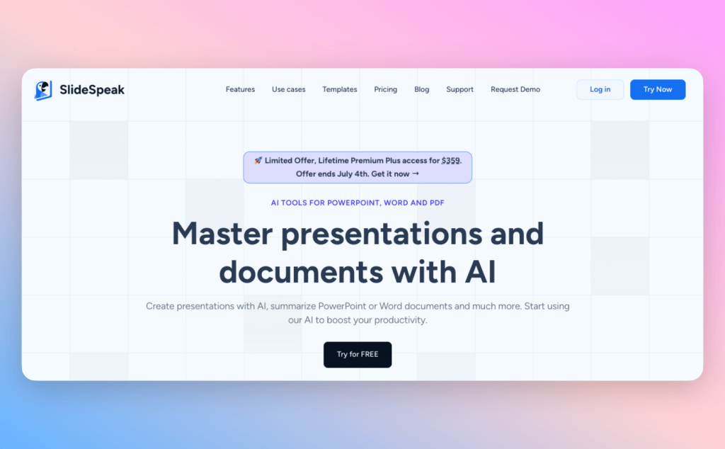
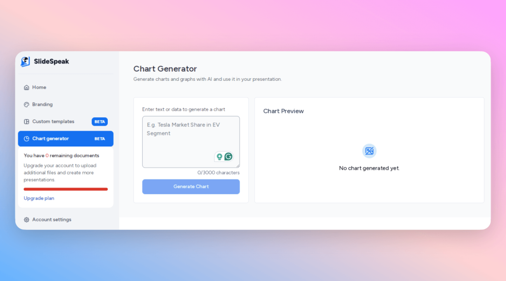
#6: SlideSpeak
Excels at: Turning complex content into presentation slides
Strengths: Inline chart editing, document-to-slide intelligent conversion
Weaknesses: Still in beta; limited direct data input handling
Integration with PowerPoint: Export-ready (full decks)
Real-time collaboration: Yes (shared deck editing)
SlideSpeak isn’t just a chart tool—it’s a slide automation assistant. Designed for professionals who work with long documents, PDFs, or Excel sheets, SlideSpeak turns unstructured content into clean, insightful presentations using AI.
You describe your chart or dataset in plain English (“Visualize revenue split by region”), and the AI generates visuals along with slide context. While Excel-to-chart integration is still maturing, its prompt-first experience works well for those comfortable articulating what they want, even before formatting data.
Supported chart types include bar, line, pie, stacked column, and basic tables, though it currently lacks more advanced visuals like Gantt or Mekko. SlideSpeak’s strength lies in how it blends AI summarization with visual storytelling, creating slide-ready layouts and commentary around your input.
Once slides are generated, users can edit layouts, visuals, and narratives collaboratively. Real-time feedback and version control make it a strong Think-cell alternative for teams handling diverse content inputs beyond just spreadsheets.
Best for:
- Professionals and teams who prefer natural language input to generate charts
- Users needing quick summarization and slide generation from complex documents
- Educators, consultants, and project managers handling detailed reports
How to Visualize Your Data with SlideSpeak
- Start with written prompts:
Describe your data or the type of chart you need in plain English. The AI will interpret your input and generate a corresponding visual. - Review generated visuals:
Check the AI-created charts and make any necessary adjustments to fit your analysis. - Generate presentation slides:
SlideSpeak organizes your visuals and key points into a polished slide deck. You can edit content, tweak layouts, and customize styles within the app. - Export or share:
Download the finished presentation as a PowerPoint or a PDF, or share editable files with your team for collaboration.
If you want an AI-first tool that combines flexible, prompt-based charting with smart document summarization, SlideSpeak is a compelling option to explore. Discover more here!
Choosing the Right Alternative: What to Consider
Not all Think-cell alternatives are built alike. Some shine at crafting complex charts with pinpoint accuracy, while others specialize in building the story around the numbers. The real trick? Matching the tool to the way you work.
If you spend your days deep in spreadsheets, you might gravitate toward a complete chart maker like PowerDrill AI or Power BI, which turn raw data into actionable visualisations. If storytelling is more your speed, tools like Pageon AI or SlideSpeak offer lightweight, user-friendly interfaces that translate messy inputs into clean narratives.
Before choosing, look beyond the spec sheet. Ask:
- Does it play well with my current tools (like Excel or PowerPoint)?
- Can my team collaborate in real time?
- How much control do I want over chart types and layouts?
- Do I need quick wins or deep dives?
Ultimately, it’s not just about advanced features—it’s about finding an authentic software experience that fits into your workflow without friction. One that helps you move faster, think clearer, and deliver presentations that actually land.
Final Thoughts: Beyond Think-cell—What Comes Next
If Think-cell was the gold standard for chart automation in yesterday’s boardrooms, today’s teams are reaching for something more. In 2025, we’re not just building classic charts—we’re crafting actionable visualisations that tell smarter stories, faster. And the top Think-cell alternatives with AI aren’t just copying the old model—they’re redefining it.
What stands out in this new wave of tools isn’t just their advanced features or intuitive design, but how they respond to the realities of modern work: messy data, rapid deadlines, and the need for clear insight in every slide. Whether you’re using a complete chart maker like Power BI, a user-friendly interface like Pageon AI, or a breakthrough tool like ChatGPT ADA, the best solutions aren’t just about speed—they’re about surfacing meaning. And if your workflow starts with complex reports or dense documents? Tools like SlideSpeak offer a uniquely fluid way to turn content into clarity, blending AI smarts with authentic software experiences to create presentations that feel less like work and more like progress.
This new generation of integrated charts isn’t just built for slide perfection—it’s built for key business decisions. For turning raw Excel chaos into clarity. For giving teams tools that think alongside them.So if you’re still relying on legacy chart templates and hoping for inspiration, it might be time to explore what’s next. Because in a world of AI-first workflows, success doesn’t come from automation alone—it comes from insight, clarity, and choosing the right tools to build your next successful business story.