
10 Tools for Generating Charts for Presentations with AI
With the rise in access and abilities of generative AI tools, creating words and visuals for anything is now possible with just one prompt. Charts and graphs are known to be one of the most frustrating steps in the process of creating a compelling presentation, and now there are dozens of AI tools that can generate charts for presentations using text prompts, spreadsheets, or even code. There are three main categories: LLM chatbots, code-generation tools, and design-specific chart generators.

In this post, we tested 10 different AI tools across these three categories to find out which ones are the best at using AI to produce charts for presentations, how easy they are to use, and who they’re really built for:
- LLM-powered chatbots like Grok, Gemini, and ChatGPT
- Code-generating AI like V0.dev, Claude, and Lovable
- Design-focused AI chart tools like Venngage, MagicChart, Piktochart, and SlideSpeak
With so many AI-powered tools available at our fingertips, which ones really deliver? Keep reading to find out which factors earned these tools their final score.
Quick Comparison Table
| Tool | Export Options | Ratings (UI, Customization) | Score | Ideal Users | |
|---|---|---|---|---|---|
| Grok | PNG, API | ★★★★☆ ★★☆☆☆ | 6/10 | Executives, Research Teams | |
| Gemini | PNG, JSON | ★★★★★ ★★★☆☆ | 8/10 | Presenters, Teachers, Beginners | |
| V0.dev | Screenshot, Code | ★★★☆☆ ★★★☆☆ | 6/10 | Developers | |
| Lovable.dev | Screenshot | ★★★☆☆ ★★★★☆ | 7/10 | Data Analysts, Marketers | |
| Claude | TSX (Code), Screenshot | ★★★★☆ ★★★☆☆ | 7/10 | Analysts, Developers | |
ChatGPT | Screenshot | ★★★★☆ ★★☆☆☆ | 6/10 | Beginners, Educators | |
| Venngage | PNG, PDF, HTML | ★★★★☆ ★★★★★ | 9/10 | Designers, Marketing Teams | |
| MagicChart | Native Slides Embed | ★★★☆☆ ★★★☆☆ | 6/10 | Teachers, Remote Presenters | |
| Piktochart | JPG, PNG, PDF | ★★★☆☆ ★★★☆☆ | 6/10 | Consultants, Corporate Teams | |
| SlideSpeak | Native, PNG, SVG | ★★★★★ ★★★☆☆ | 8/10 | Slide Creators, All Users |
LLM Chatbots: AI That Generates Charts from Prompts
The rise in popularity of large language models has made it possible to get help with any task for work or school. We wanted to test their capability when it comes to generating charts for presentations, seeing as design-forward AI tools already exist for this exact purpose. As suspected (although still impressive), one can simply say, “Create a line chart of quarterly revenue vs. marketing spend,” and the AI will return a presentation-ready graph. The process is that simple: provide a prompt, paste your data in a table or a document, and receive a chart almost immediately. Usually this comes along with some extra insights from the AI into the data itself, and some description of how it has interpreted it to make your chart.
We tested Grok, Gemini, and ChatGPT, to see how well these tools interpret prompts, deliver results, and handle editing and customization:
Grok by xAI
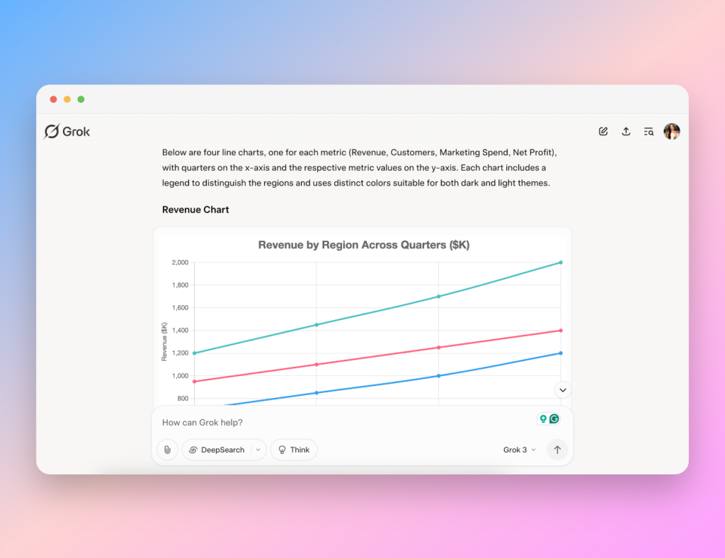
Grok delivers fast chart generation and impressively detailed AI-powered data insights alongside its visuals. As an AI chart generator, it interpreted simple prompts accurately, producing interactive charts that highlight data points when you hover over them. However, the responses can be tedious and paragraphs often follow simple requests. This leads to scrolling through analysis and insights before reaching the actual chart.
When we pushed it further, asking for a radar chart or editing the chart type, it began to stumble. Grok struggled to render a scatter plot and eventually froze, presenting raw code and suggesting the use of Chart.js (the framework it uses to generate charts) instead of finishing the request in the chat.
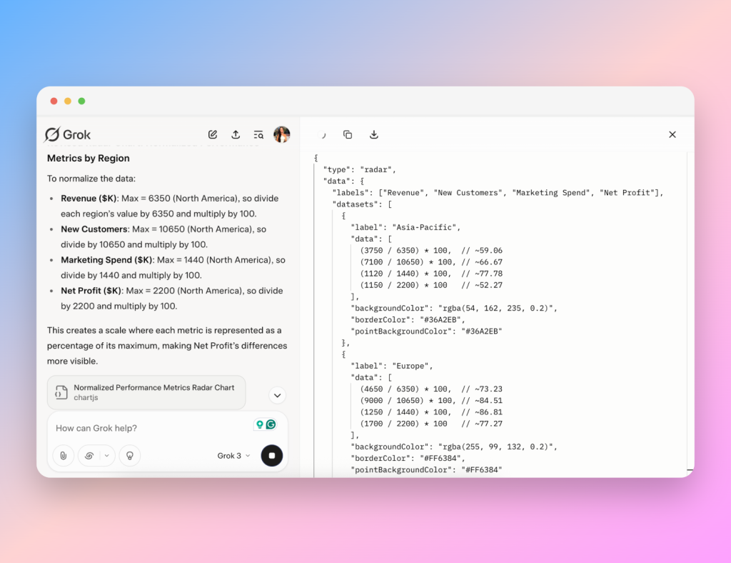
This highlights one limitation of Grok as an AI chart generator: it handles basic charts well but can’t deal with more complex needs.
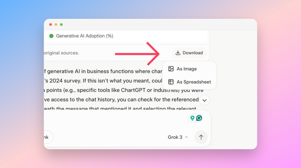
Grok’s export options are limited to a single PNG or spreadsheet file. This lacks flexibility and consistent naming for organized workflows.
Pros:
- Strong analytical responses
- Interactive hover elements
- Rapid AI chart generation
Cons:
- Long replies to simple prompts
- Limited to PNG export
- Struggles with complex or unusual chart types
Gemini by Google
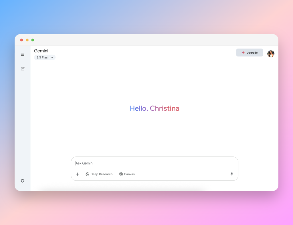
Gemini, especially with its latest 2.5 models and the research functions, stands out as a smooth AI tool with an intuitive interface. As an AI tool, it can even produce interactive charts that support hover tooltips and zoom scrolling. The experience was so seamless and pleasant, I would rate Gemini highly on all levels.
Overall, Gemini is a reliable AI data visualization tool for anyone who needs fast, usable visuals with minimal fuss.
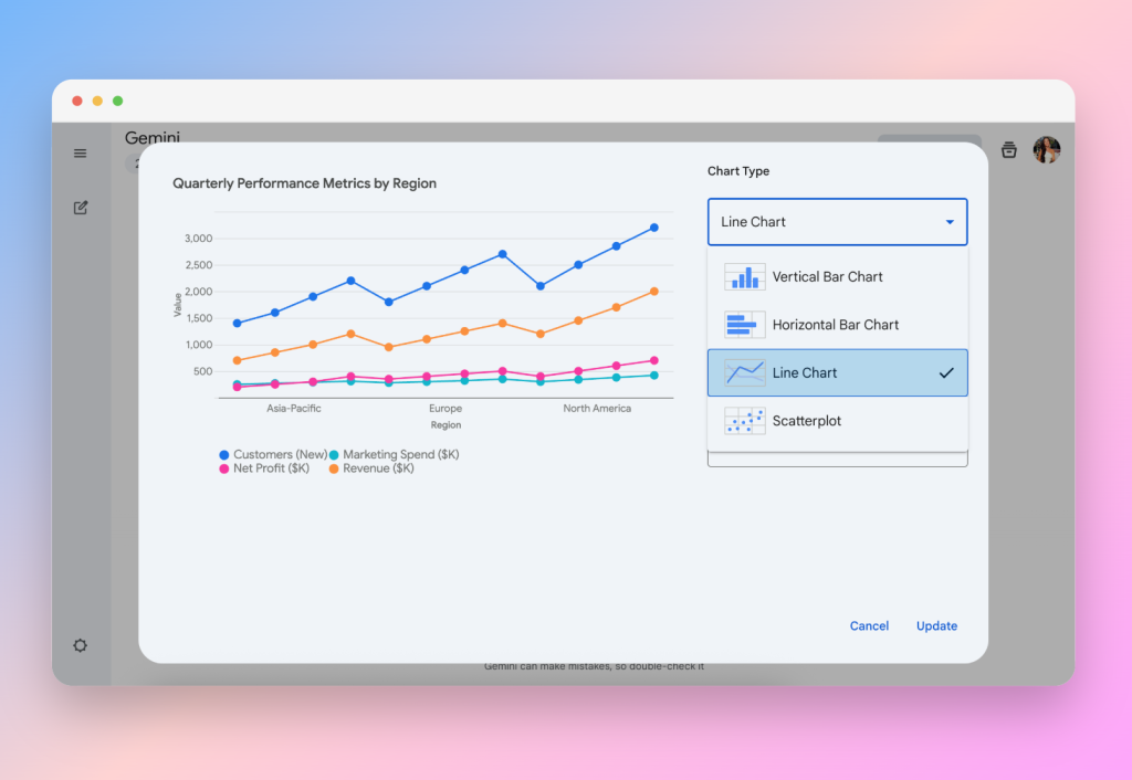
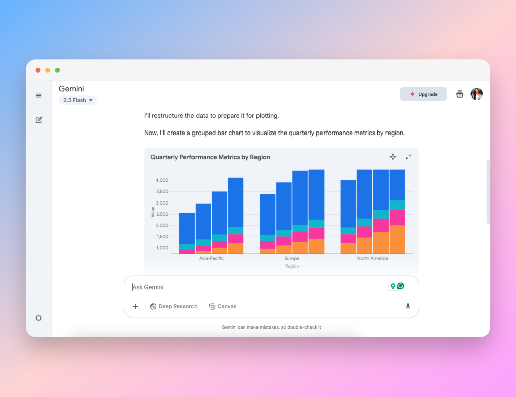
While it could not generate a radar chart, it excelled at chart customization: users can switch chart types, adjust color schemes, and tweak labels in a dedicated “customize” section without interrupting workflow. Responses are typically concise—sometimes very brief—but the chart quality meets expectations.
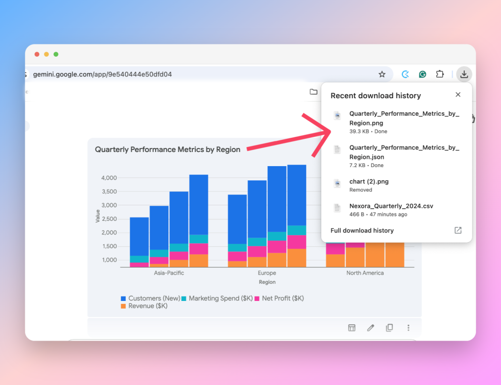
Gemini auto-names exported files based on the chart title, a small but thoughtful detail. Exports are available in both PNG and JSON (JavaScript Object Notation, readable by humans and machines)—ideal for developers who want code-based charts as well as for everyday presenters needing static images.
Pros:
- Interactive charts with zoom/hover
- Auto-named exports
- Quick and accurate chart generation
Cons:
- No radar chart support
- Occasionally too brief in explanations
ChatGPT by OpenAI
ChatGPT is by far the most popular AI tools, its uses are practically limitless and many of us are already familiar with it. It was the fastest tool to generate charts, producing a simple but clear line chart within seconds. As an AI chart generation tool, it briefly explains the result of your prompt but offers no deeper insights or comparisons from your data.
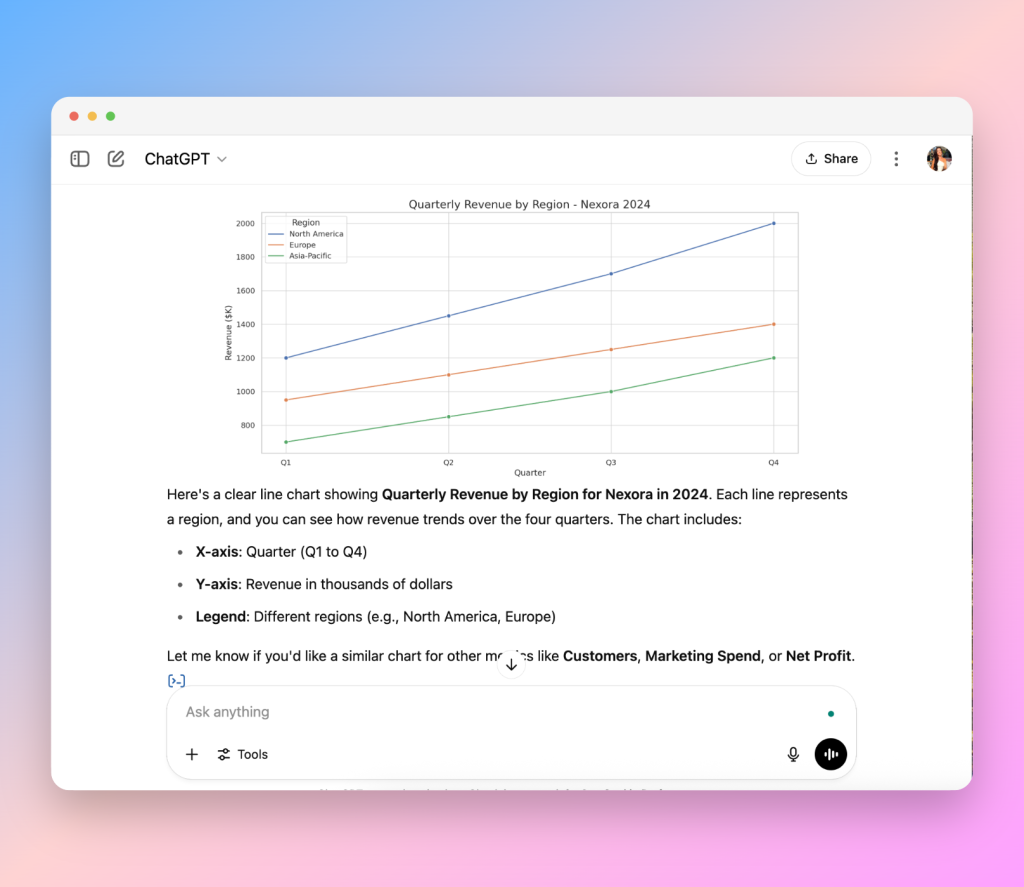
Users are limited to a single data analysis prompt per free session, and the model only generates basic chart types, usually a line graph for one metric even if your data set contains multiple metrics. There is no support for complex or multi-series visuals like our radar chart test, and customization options are minimal. I also wasn’t able to save the chart file besides taking a screenshot to use in a presentation, as seen below:
For those needing a quick, clean visual without extra analysis, ChatGPT can be a useful AI tool. However, the lack of advanced features makes it less suited for those of you wanting to add an impressive design to your slides, and the limitations definitely show.
Pros:
- Fast chart generation
- Clear execution of simple prompts
Cons:
- No complex chart support
- Minimal data insights
- Limited customization
Code-Generating AI Tools: Developer-Level Chart Customization
For more technical users, tools like V0.dev, Claude, and Lovable stand out by producing customizable code that renders high-quality and interactive visuals. These AI tools for developers give full control over styling, layout, and hover responses, but are they practical for building charts to eventually use in a presentation deck?
v0.dev by Vercel
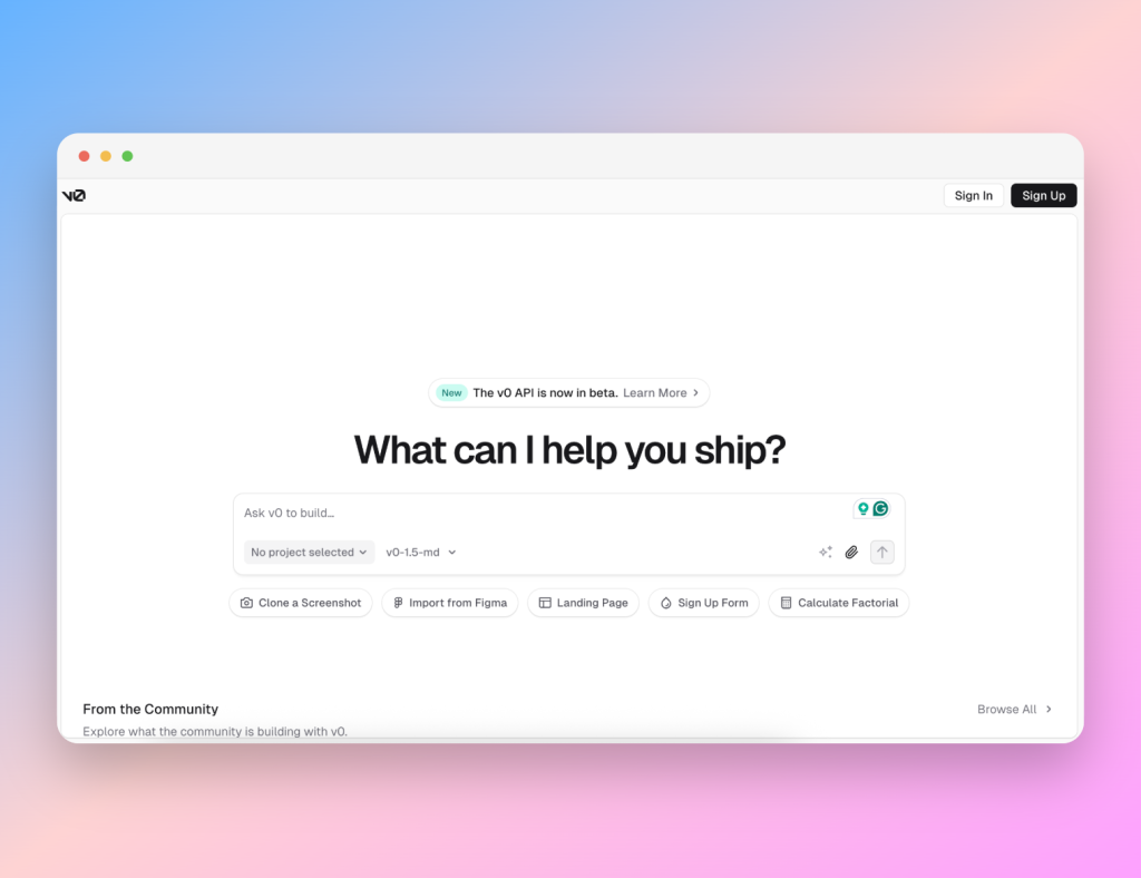
From your first prompt, v0 generates a variety of chart types, accompanied by clean insights.
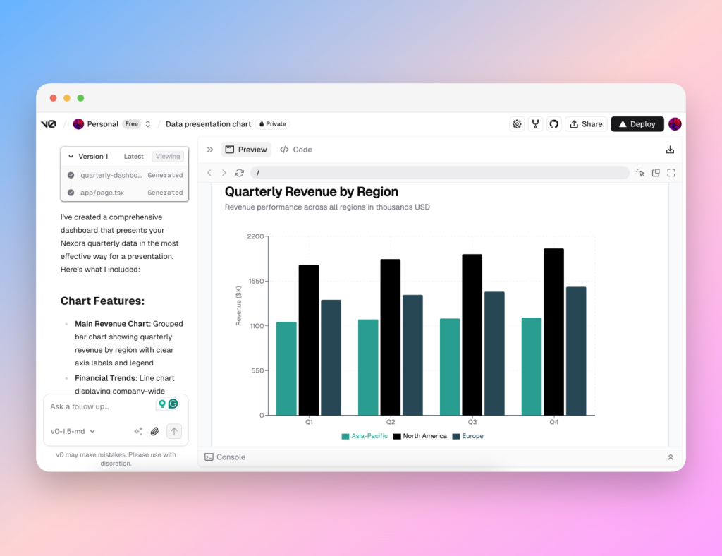
Chart generation takes a minute or two since it’s rendering code into visual elements, and everything is built around writing JSX (an extension of JavaScript) code for their use of React elements.
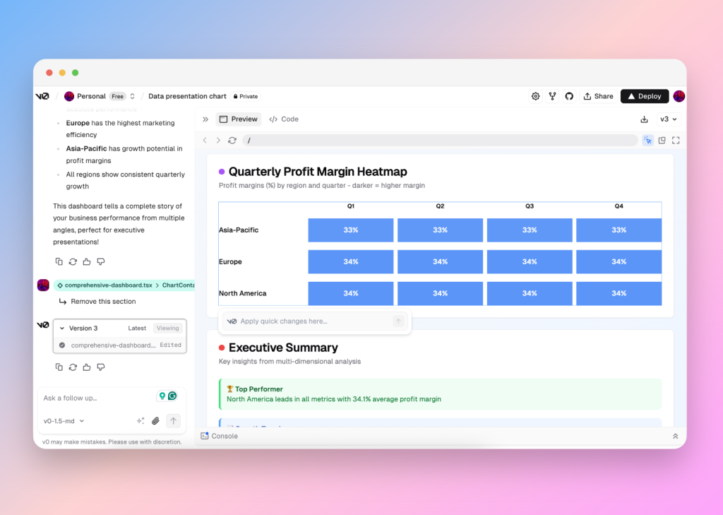
v0 doesn’t manage well with too complex or intricate requests: it couldn’t produce a radar graph, and exporting visuals for use in a presentation isn’t straightforward; your best option is to screenshot the result. You can see the tool struggling with some of the visualization below, although the user can manipulate the graphics.
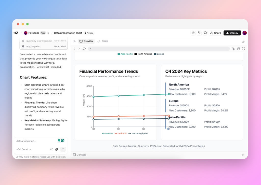
That said, v0.dev gives you direct control over code and design through the “select” function and in-picture text boxes to offer short prompts for necessary changes. This makes the dashboard interactive and easy to edit color, labels, and chart type without rewriting your whole prompt, although users wanting a quick fix to a perfect chart might not enjoy being hands-on.
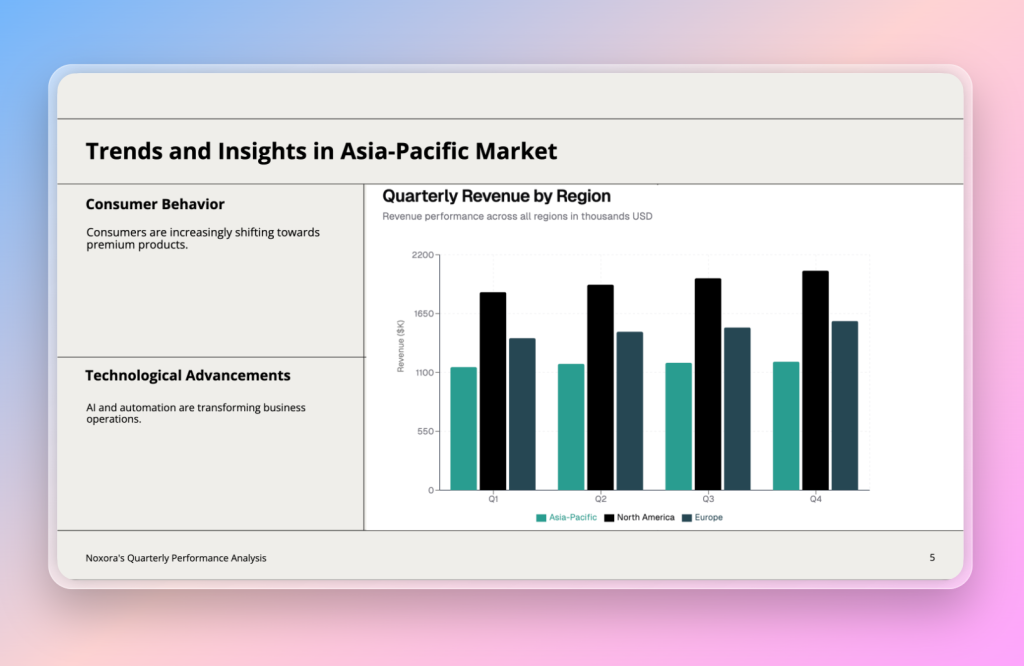
As an AI visualization tool primarily built for developers, v0 is best suited for users comfortable embedding code, otherwise, you’re just capturing screenshots for your presentation as seen above. Although it doesn’t turn out too badly.
Pros:
- A variety of visuals and insights on first response
- Developer-level control
Cons:
- Requires screenshots for presentation use
- Unable to meet complex demands that also require intricacy
- Slower generation times
Claude by Anthropic
https://www.anthropic.com/claude
Claude presents a balanced AI chart generation tool with concise, clear explanations of choices, interactive hover tooltips on the charts themselves, and useful data insights.
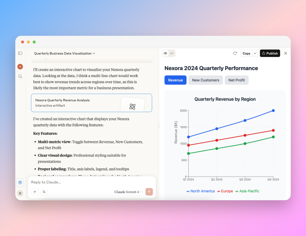
The tool is capable of producing animated line graphs, multi-metric comparisons, and, one of the few LLMs able to render a complex radar chart accurately. However, when asked to change the background color of the element, it wasn’t successful even after a few varied attempts. Claude very kindly explained the limitations of the framework it uses: turns out, Claude uses Recharts, a charting library by React, which is predominantly designed for developers.
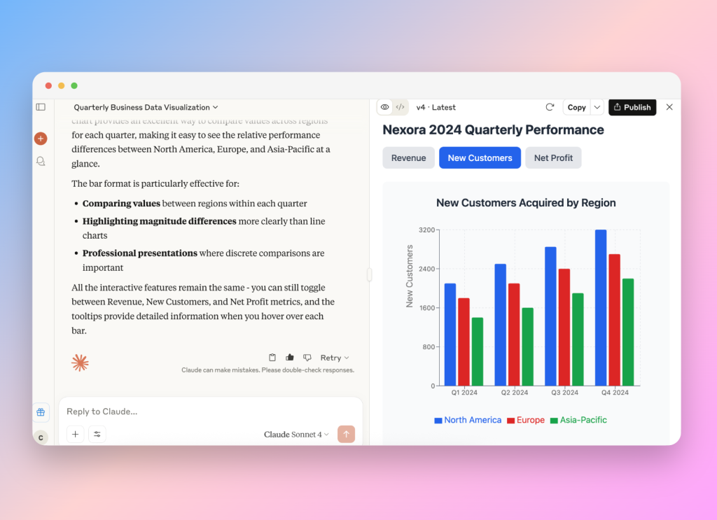
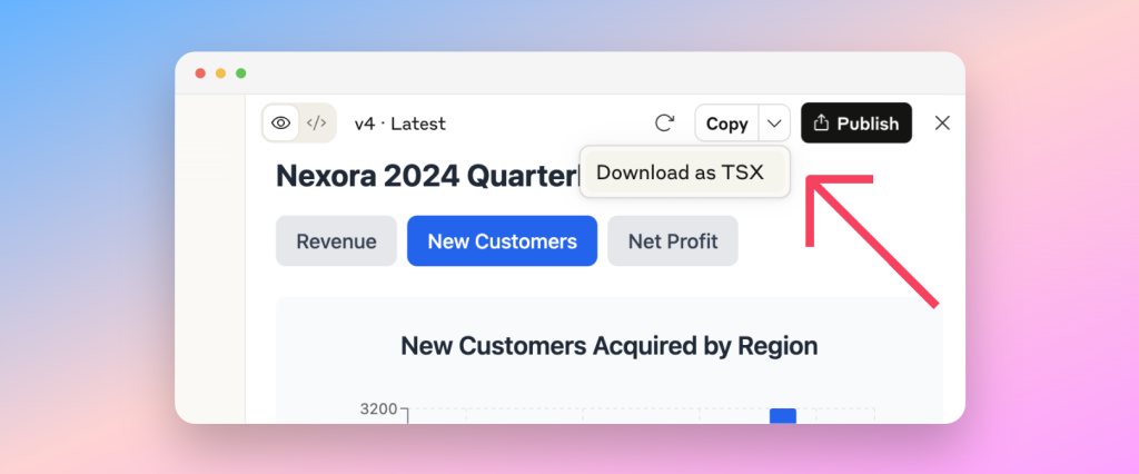
Chart files are exported as TSX (TypeScript JSX), requiring a software development environment to render visuals outside the chatbot.
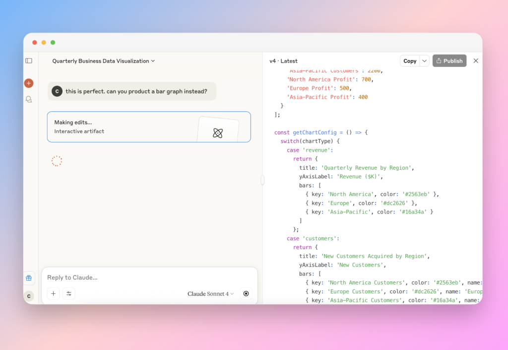
In terms of AI data visualization, Claude is well-suited for analysts and developers who want both code integration and interactive, insights-driven charts, despite styling limitations. For the everyday user, one would need to screenshot your chart to use in a presentation and therefore lose the interactive elements that made the chart so interesting in the first place.
Pros:
- Accurate complex chart generation
- Concise design feedback and insights
- Interactive multi-metric animated charts
Cons:
- Exports as code instead of images
- Limited styling options for certain elements
Lovable.dev
Lovable is a visually rich AI code generator that often goes beyond basic prompts without asking. It created a “business intelligence dashboard” from a data set of just numbers and offered multiple choices of graphs from one initial prompt.
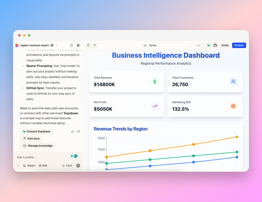
It analyzes data more deeply than expected, offering ROI calculations, marketing spend versus profit comparisons, and profit trends, while providing hover-enabled graphs with contextual tooltips. Lovable goes even further to list the hex codes used and even passed the more complex radar chart test.
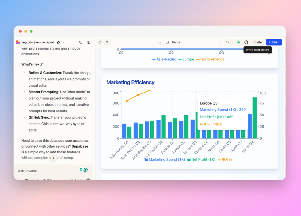
Once again, it was discovered that Lovable uses Recharts to satisfy this functionality. The main drawback is that charts cannot be downloaded directly; you need to screenshot them to use in your presentations. Despite this, its creative design elements and detailed insights (even above the other tools using the same chart library) make Lovable.dev an attractive AI-powered chart-generating tool for marketers and data analysts.
Pros:
- Creative responses
- Interactive charts with hover insights
- Complex chart support with styling control
Cons:
- No direct export—screenshot required
- Overinterprets data without asking
Design-Focused Tools: Polished Charts for Presentations
Some tools are built specifically for non-designers who need fast, polished visuals. Platforms like Venngage, Piktochart, MagicChart, and SlideSpeak offer presentation-ready charts (and slide decks) without code or complicated settings. We tested how well they balance ease of use, branding features, and overall AI generation. Most of these AI chart generation tools respond with an image or an embedded chart. Some let you customize with follow-up prompts or familiar click-and-drag edits.
Venngage AI Chart Maker
https://venngage.com/ai-tools/chart
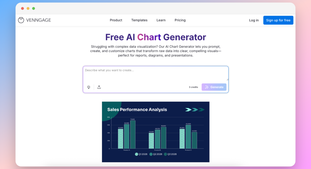
Venngage blends AI-driven chart suggestions with a drag-and-drop interface (reminiscent of Canva), making it a go-to data visualization tool for brand-focused presentations.
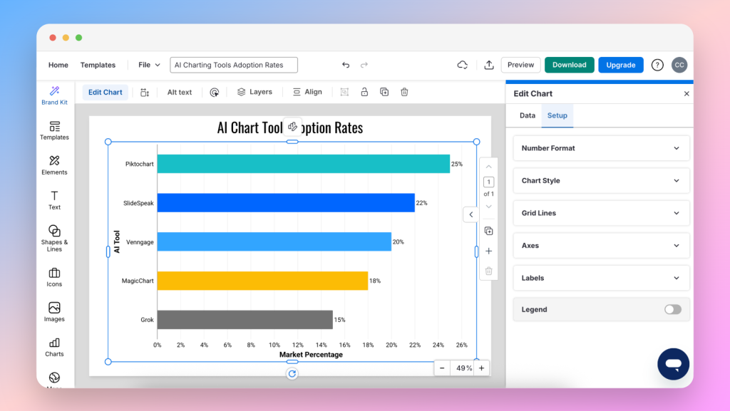
Venngage’s AI recommends chart types based on provided data, and users can choose from presentation-ready templates that align with their visual goals. Hovering over chart elements reveals interactive tooltips with additional insights, while the Brand Kit feature ensures consistent fonts, colors, and design elements.
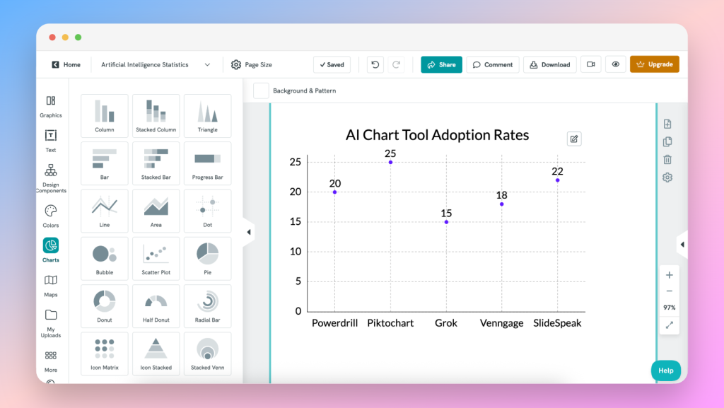
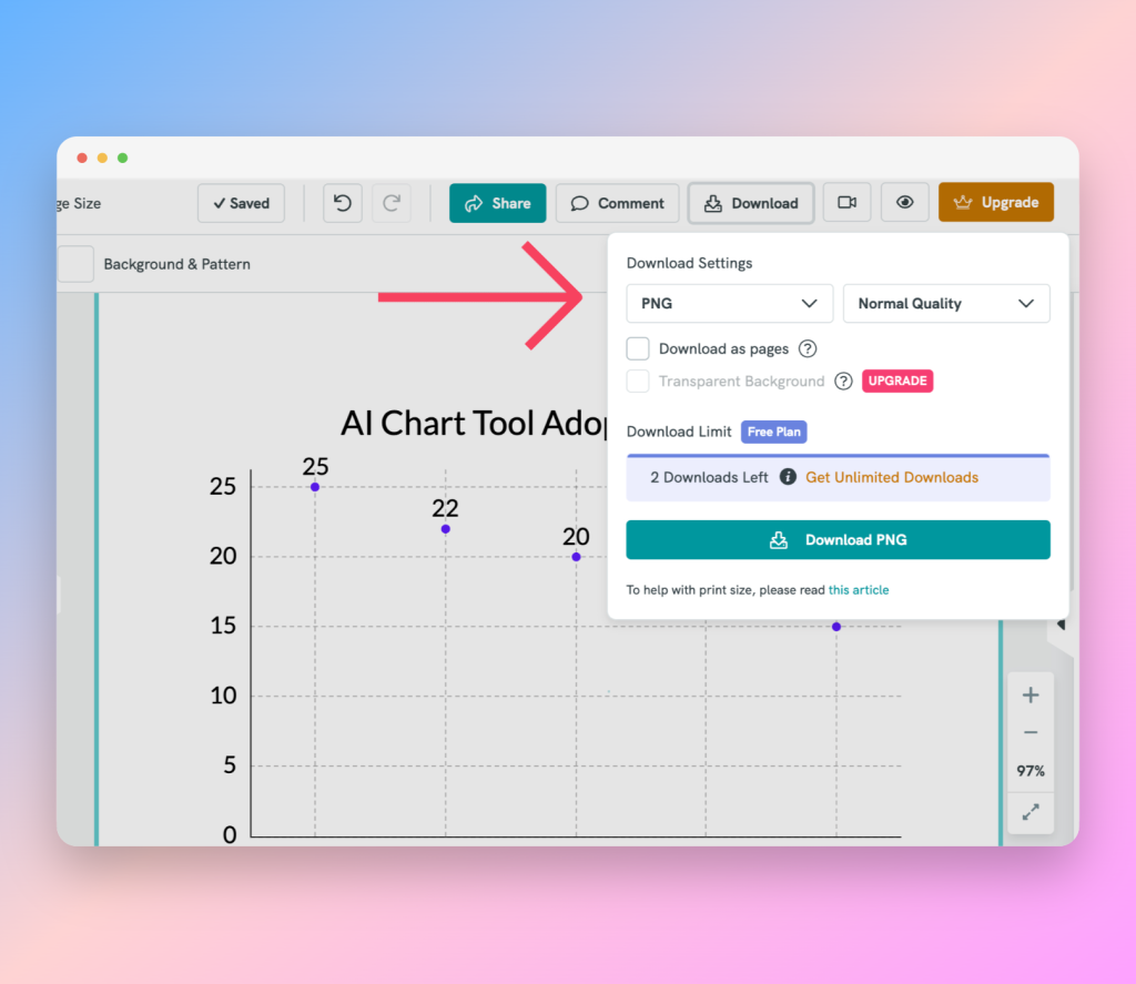
Exports are available as PNG, PDF, or interactive HTML—ideal for both static slides and embedded web presentations, however, this is limited to two downloads without a pay plan. Still, I’d recommend Venngage for designers and marketing teams who want polished visuals along with the autonomy of creative control.
Pros:
- Design customization capabilities
- Interactive hover tooltips
- Multiple export formats (PNG, PDF, HTML)
Cons:
- Requires a paid plan for advanced templates
- Slight learning curve for non-designers
- Perhaps too interactive if you just want a simple chart
MagicChart by MagicSlides
https://www.magicslides.app/tools/magicchart
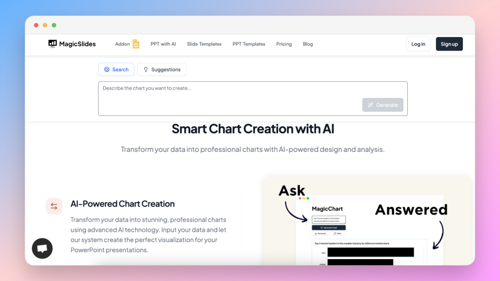
MagicChart is an AI chart generator designed for Google Slides presenters who want zero context-switching. Available as an add-on for Google Slides, it allows users to paste data (or provide a prompt) directly within the slide deck. For this article, I tested their webpage version and found it to be rather basic.
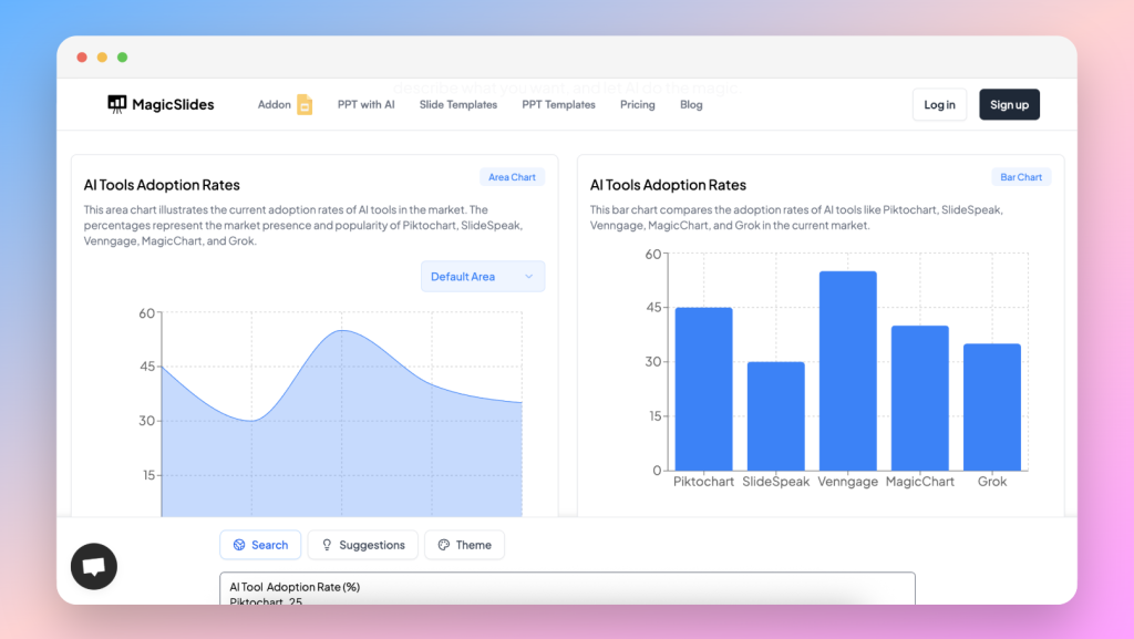
Charts appear instantly on the canvas and are fully customizable: resize, change colors, and update data directly on the chart. Exports aren’t necessary in the add-on since MagicChart produces native slide objects, but you can export to PNG for use in SlideSpeak or other platforms. It’s ideal for educators, remote teams, and anyone already in love with Google Workspace.
Pros:
- Completely integrated with Google Slides
- Instant in-slide chart generation and editing
- No export needed for slide usage
Cons:
- Limited styling options compared to standalone tools
- Has a dashboard on MagicSlides.app, but is basic and has some bugs
Piktochart AI Graph Generator
https://piktochart.com/ai-graph-generator/
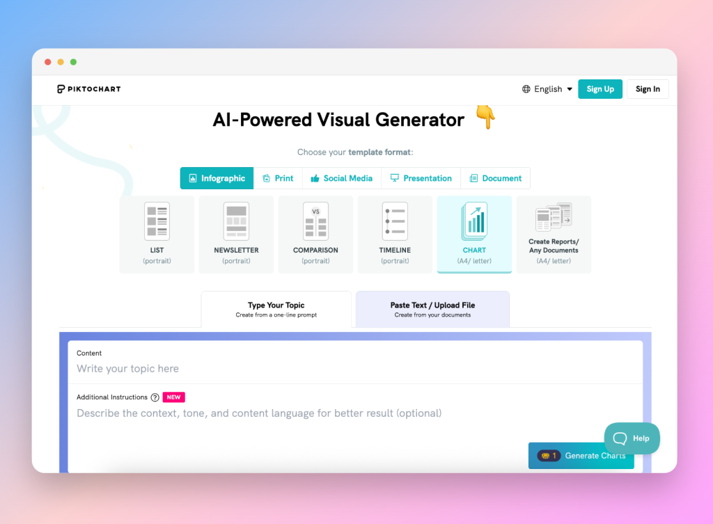
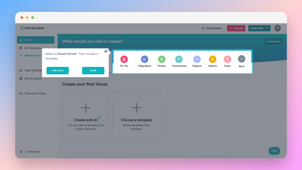
Piktochart’s AI chart generator exists within a broader infographic creation suite, offering a guided experience that balances data storytelling with design-first features.
Users import data via CSV (comma-separated values), Excel, or Google Sheets, then follow a wizard-like interface that recommends chart types and templates that have already been designed for reports, dashboards, and slide decks.
The side panel streamlines styling and customization, and changes are live. Piktochart is perfect for consultants and corporate teams who need polished, data-heavy presentations that are more visual than anything.
Exports are available in JPG, PNG, or PDF, and charts are fully compatible with SlideSpeak, PowerPoint, and Canva.
Pros:
- Wizard-driven setup for non-designers
- High customization with template library
- Multiple export formats (JPG, PNG, PDF)
Cons:
- Designs are pre-set and harder to get around for users wanting autonomy
- Advanced features require payment
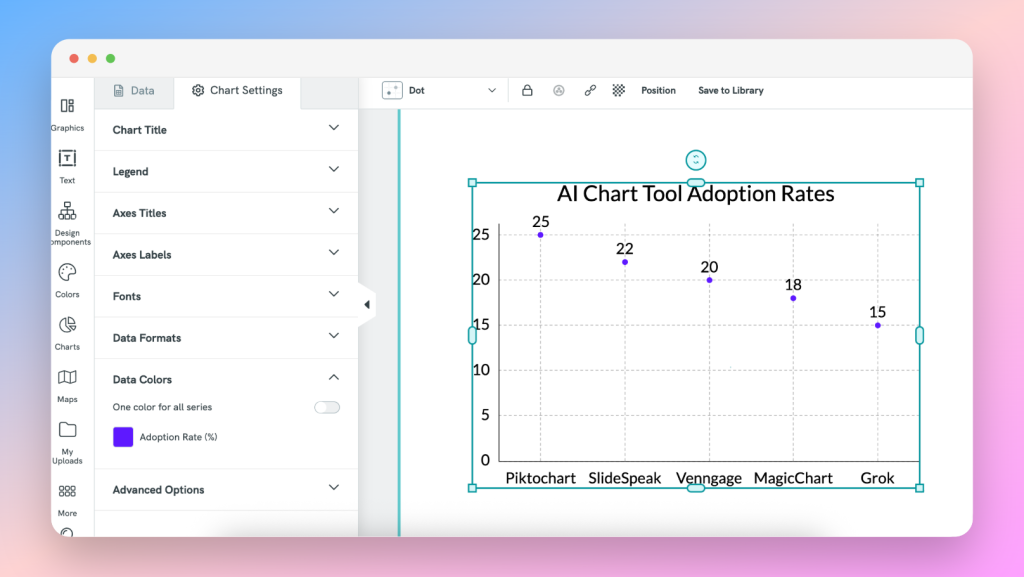
SlideSpeak’s Native AI Chart Generator (beta)
SlideSpeak is an AI-powered platform, respected for it’s presentation deck-generating abilities. It is now working on an integrated AI chart generator that redefines efficiency by embedding chart creation directly into the slide editor.
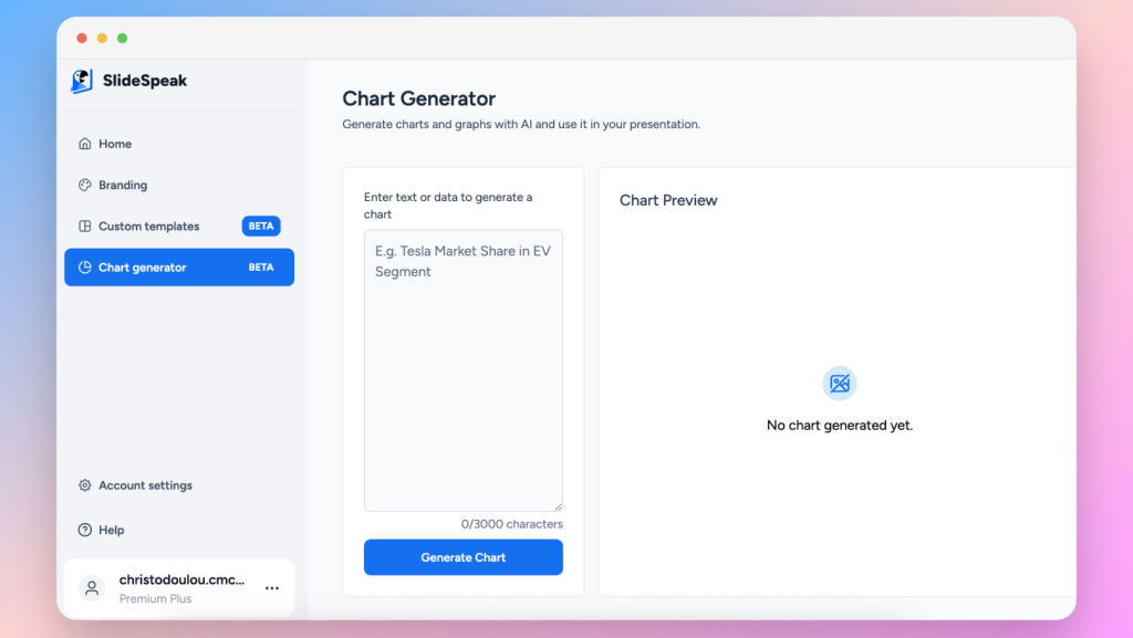
While in beta, users can try the Chart Generator by simply writing their prompt and pasting their dataset.
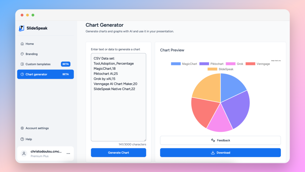
SlideSpeak is the ultimate solution for consultants, agencies, educators, and corporate teams seeking a seamless workflow with no context-switching, as all features will be found on one comprehensive dashboard.
With the upcoming in-slide chart generator and editor, users will be able to select from presentation-ready templates that inherit slide themes automatically.
Pros:
- Start-to-finish slide and chart workflow
- Automatic theme matching for consistent branding
- Inline chart editing and real-time collaboration
Cons:
- Advanced analytic chart types not yet supported
- This will be a new addition to the still-expanding platform
Final Thoughts
AI LLM tools and chart generators have transformed data visualization for presentations, offering rapid prototypes and completely customizable designs. There’s a solution for every workflow and skill level, but SlideSpeak’s integrated chart feature redefines seamless by embedding your chart creation directly within the slide editor, eliminating exports, preserving design consistency, and accelerating collaboration.
Create your next AI-powered chart with SlideSpeak: Get Started
FAQs
Q: Are these AI chart tools free?
All are free to use. However, with some tools, exporting high-res or branded visuals sometimes requires a paid plan.
Q: Can I use them with PowerPoint?
Yes! Most tools export as PNG or SVG, perfect for inserting into PowerPoint, Keynote, Google Slides, and SlideSpeak.
Q: What makes SlideSpeak different?
Unlike other tools, SlideSpeak is purpose-built for creating presentations start-to-finish, now with chart generation built in. It’s uncomplicated, intuitive, and part of a unified workflow.