About this design
Where the Bento style comes from, and what it signals.
Bento takes its name from the Japanese lunch box. The look comes from launch pages for phones and software, where rounded compartments each hold one feature and the biggest one holds the headline. On a slide, you scan a dozen features at once without reading a bullet list.
Each slide is a 6 by 4 grid with 12px gutters and a 24px outer margin. Tiles vary in span, and each slide has a hero tile of at least 3x2. White #ffffff tiles sit on light gray #efeff1 with no borders or shadows. Corners step down from 24px on tiles to 12px on inner elements, and pills are round. One sunflower #ffb800 tile holds the key fact; at most one ink #1c1c1e tile adds contrast. Geist sets everything, with hero numbers at weight 600 to 700 and tight tracking.
Pick it for a deck of good news that needs an order: a feature launch, a release recap, a quarterly product update or a metrics review. Give your lead feature the biggest tile, and your audience sees what matters most before reading a word. For a linear argument, choose a theme with one idea per slide.
Use it for
- Product launch and release decks where several features compete for attention
- Quarterly product updates that mix metrics, customer quotes and roadmap items
- Beta results and adoption reviews built around a few headline numbers
- Launch keynotes that should look like a modern product page
- Roadmap slides organized as now, next and later
Skip it for
- Linear stage talks with one idea per slide; Keynote Minimal or TED Style suit a single statement
- Dense analytical decks with full charts and sourced exhibits; Telemetry or Benchmark have room for them
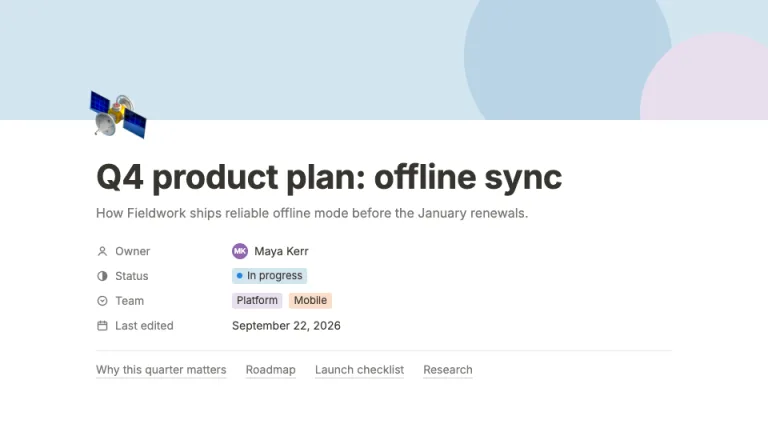
- Workspace-style planning docs with checklists and databases; Notion Style fits that format
The presentation design prompt
This is the exact text that gets sent to your AI.
Create a presentation in the 'Bento' theme, a modular tile grid in the style of product launch pages. Background: light gray #efeff1 on every slide. Typography: 'Geist' (Google Fonts) for everything; hero numbers and titles at 600 to 700 weight with tight letter spacing (-0.03em to -0.05em), tile titles 15 to 24px weight 600 in #1c1c1e, body 13 to 16px in #3a3a3f, secondary lines 12 to 13px in #86868b, nothing below 12px. The signature is the grid itself: every slide is a 6-column by 4-row grid with 12px gutters and a 24px outer margin, and tiles must vary in span. Each slide has at least one hero tile spanning 3x2, 3x3, 4x3 or 4x4, mixed with 1x1, 2x1, 1x2 and 2x2 tiles; never a row of equal cards. Radius hierarchy: tiles 24px, elements inside tiles 12px, pills fully round. Tiles are white #ffffff and separated by the gutter alone: no borders, no shadows. Exactly one tile per slide is sunflower #ffb800 with #1c1c1e text, carrying the single most important fact; at most one tile is inverted ink #1c1c1e with white text and #a1a1a6 secondary text. Each tile holds one content type only: a big stat, a sparkline, a mini bar chart, a quote, a short list, a CSS-drawn product window, or a label. The headline sits inside a tile, never floating above the grid. Title slide: a 4x3 hero tile with a small gray pill and the product name at 80 to 96px, a sunflower tile with the version number, a date tile, a presenter tile and an ink tile with the agenda line. Feature slides: one tile per feature, sized by importance, the lead feature in the hero tile with a small CSS mock of it. Metric slides: a hero stat at 110 to 140px with its unit at a quarter of the size and a #fff1c7 delta pill, a sparkline tile drawn as a 2.5px #1c1c1e line ending in a sunflower dot, a bar tile with bars in #d6d6db and the one that matters in #1c1c1e, a sunflower delta tile, an ink quote tile. Product slides: a CSS app window in a 4x4 tile with #efeff1 chrome and 1px #e2e2e6 dividers, annotations in their own tiles beside it, not arrows over it. Roadmaps: Now, Next and Later tiles that shrink as certainty drops, Now in sunflower. Closing: one 5x4 tile with the call to action at 80px plus a small ink tile with the URL. There is no footer bar or chrome outside the grid. Strictly avoid: identical tile sizes, rows of equal cards, drop shadows, borders around tiles, gradient washes, glassmorphism or blur, more than one sunflower tile per slide, icons in every tile, emoji, monospace fonts, text below 12px, centered text blocks, headlines above the grid on content slides, stock photos, device mockup frames.

Use this theme for my slides. Ask me what the presentation is about first, then apply the theme to every slide.
View this prompt and its data on GitHub
How to use this prompt
From copied text to a finished Bento deck in four moves.
- 01
Copy the prompt
Use the copy button, or open it pre-filled in Claude or ChatGPT with one click from the panel on this page.
- 02
Tell the AI your topic
The prompt instructs the AI to ask what your presentation is about first. A sentence or a pasted outline is enough.
- 03
Generate and iterate
Ask for more slides or swap a layout. The avoid list at the end of the prompt keeps Bento on-style while the content changes.
- 04
Or skip straight to a deck
SlideSpeak turns your topic or document into a finished Bento presentation, exportable as PowerPoint or PDF.
Common questions
Working with the Bento presentation design prompt in practice.