About this design
Where the BlackRock Outlook style comes from, and what it signals.
We rebuilt the page layout of the global outlook the BlackRock Investment Institute publishes each December, so you can make a BlackRock outlook presentation for your own house view. Each page has a colored tab at the top edge naming the section, a heavy black headline, and a thick black rule between the argument on the left and the exhibit on the right. This is an unofficial homage with no affiliation, license or endorsement from BlackRock, Inc.
Each section gets one color. Yellow #ffce00 marks the investment environment, vermilion #ff4713 the themes, green #008b5c the mega forces and pink #fc9bb3 the views, and each section's implications box takes its tab color as a top bar over a pale tint. Onest stands in for the house sans at weight 800 for headlines, and Barlow Condensed sets the source notes and disclaimers.
Pick it for an annual or midyear market outlook, or for a CIO letter you need to turn into slides. The signature slide is the tactical views table, where a seven-cell meter shows each asset's conviction from underweight to overweight and a black dot marks where your view sat last quarter.
Use it for
- Annual and midyear market outlooks from an asset manager or wealth desk
- CIO house views with overweight, neutral and underweight calls by asset class
- Scenario analysis with probability-weighted base, upside and downside cases
- Thematic research on long-term structural trends and the capital they need
- Client events where the chief strategist walks through the year ahead
Skip it for
- M&A pitch books and fairness materials; Goldman Sachs Style or Pitch Book fits banker formatting
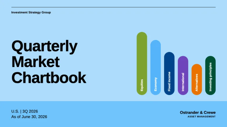
- Quarterly chartbooks with dozens of footnoted exhibits; Guide to the Markets suits a page-by-page client walk-through
- Year-end results for shareholders; Annual Report gives financial statements and highlights more room
The presentation design prompt
This is the exact text that gets sent to your AI.
Create a presentation in the 'BlackRock Outlook' theme, an unofficial homage to an investment institute's annual global outlook. Background: white (#ffffff) on content slides, black (#000000) on the cover. Typography: 'Onest' (Google Fonts) 800 for headlines at 42 to 48px with 1.0 leading, 800 at 15px for chart titles, 400 at 11.5 to 13px for body in pure black; source notes and disclaimers in 'Barlow Condensed' 400 at 10px. Signature: each content slide has a color-coded section tab flush with the top edge, 196 by 24px, bold 12px sentence-case label: yellow #ffce00 with black text for Investment environment, vermilion #ff4713 with white text for Themes, green #008b5c with white text for Mega forces, pink #fc9bb3 with black text for Views, black for Summary. Split pages: headline and two body columns left, a 4px black vertical rule, exhibit right. Exhibit stack: bold chart title, a plain subtitle with units and dates, the chart, a 'Chart takeaway:' line with the label bold, a Barlow Condensed source note opening with 'Forward-looking estimates may not come to pass.' in bold, then an Investment implications box: 9px top bar in the section color over a tint (#fff3f0, #e8fff7, #fffbef), bold 14px heading, two bullets. Charts: vermilion #ff4713 for the lead series, then #ffce00, #008b5c, #fc9bb3; #d6d5dd gridlines, black baseline, hatched bars for estimates, dashed scenario lines over a #ededf1 forecast window. Cover: a #ffce00 block on a black field with the year and 'Global Outlook' at 64px 800, a 22px bold subtitle, the institute name stacked with the middle word bold, and a #e3e3ea embargo strip in #ff4713 bold capitals. Contents: a yellow panel, bold sections with page ranges. Scenarios: probabilities at 28px 800 beside one-line cases, 1.5px black rules. Mega forces: stacked horizontal bars (public vs. private capital) with direct totals, and a bold pull quote with a yellow portrait tile. Tactical views table: black header row (asset class, View, Commentary), 1.5px black row rules, and a seven-cell conviction meter per asset: #d6d5dd cells with a taller center cell, the active cell pink for underweight, #595959 for neutral, yellow for overweight, a 10px bold label beneath ('+1', 'Neutral', '-1'), a black dot on the previous view, and a legend box above. Footer: a capitals 'Capital at risk' disclaimer bottom-left in 10px #8a8a8a Barlow Condensed, page number bottom-right. Strictly avoid: the BlackRock logo, wordmark or name on slides, claiming affiliation with BlackRock, Inc., gradients, drop shadows, rounded corners, photos, icons, centered body text, pie or 3D charts, gray body copy, colors outside the palette, content slides without a section tab, charts without a takeaway line and source note.

Use this theme for my slides. Ask me what the presentation is about first, then apply the theme to every slide.
View this prompt and its data on GitHubHow to use this prompt
From copied text to a finished BlackRock Outlook deck in four moves.
- 01
Copy the prompt
Use the copy button, or open it pre-filled in Claude or ChatGPT with one click from the panel on this page.
- 02
Tell the AI your topic
The prompt instructs the AI to ask what your presentation is about first. A sentence or a pasted outline is enough.
- 03
Generate and iterate
Ask for more slides or swap a layout. The avoid list at the end of the prompt keeps BlackRock Outlook on-style while the content changes.
- 04
Or skip straight to a deck
SlideSpeak turns your topic or document into a finished BlackRock Outlook presentation, exportable as PowerPoint or PDF.
Common questions
Working with the BlackRock Outlook presentation design prompt in practice.