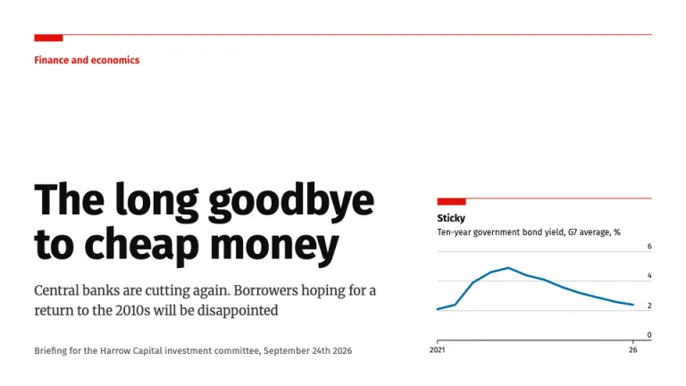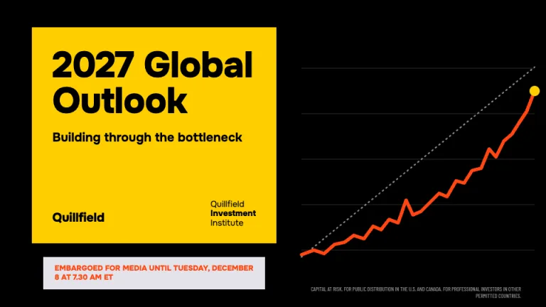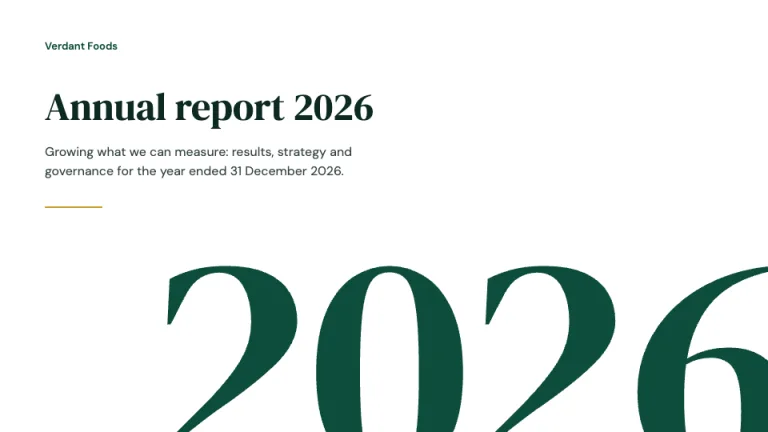
About this design
Where the Guide to the Markets style comes from, and what it signals.
This theme follows the J.P. Morgan Guide to the Markets, the quarterly chartbook that financial advisors walk clients through page by page. It is an unofficial homage with no link to JPMorgan Chase & Co. We studied the public PDF editions, where each page holds a topic title, one or two annotated exhibits and a block of footnotes.
A thin rule fences off a left rail, as in the printed book, and each section owns a colored tab in that rail: green for equities, blue for the economy, navy for fixed income, purple for international, orange for alternatives, dark green for investing principles. The tab sits lower on the rail as you move through the sections, so you can find your place from the edge of the page. Arimo matches the Arial metrics of the source, and Archivo Narrow takes the condensed chart labels.
Use this market chartbook format when your audience wants the evidence on the page, as in a quarterly outlook or an investment committee pack. The sample deck closes on the asset class quilt: one column per year ranks asset classes best to worst, and each class keeps its fill so you can follow it across the years. The prompt asks the AI to label averages and end points and to put the source under each chart, so a reader can check the numbers.
Use it for
- Quarterly market outlooks that advisors present to clients
- Investment committee packs with valuation and return history charts
- Economic briefings on jobs, inflation and rates for a finance team
- Client review meetings where you walk through asset class returns
Skip it for
- M&A board books with sources and uses tables; Goldman Sachs Style or Pitch Book fit those
- An annual house view with overweight and underweight calls; BlackRock Outlook has a tactical views table for that
- Investor pitches that lead with one big number; Traction or Midnight Pitch suit that
The presentation design prompt
This is the exact text that gets sent to your AI.
Create a presentation in the 'Guide to the Markets' theme, an unofficial homage to the quarterly market chartbook: one topic per page, dense annotated charts, heavy footnotes. Background: white (#ffffff) except on the cover. Typography: 'Arimo' (Google Fonts) for text, with page titles bold 24 to 26px in black (#000000) naming the topic in sentence case, exhibit titles bold 14px and unit lines 11px regular; 'Archivo Narrow' 400/700 for axis labels, data labels and table figures at 11 to 12px. The signature is the left rail: a 62px column behind a 1px #3e4143 vertical rule, holding the page number at the bottom and a vertical rounded section pill (24px wide, white 11px bold vertical text). The pill moves down the rail section by section like a book's thumb-index tabs: Equities #7da12e at the top, then Economy #54b5fa, Fixed income #00458a, International #6f44bb, Alternatives #eb7200 and Investing principles #005136 at the bottom. Header: the title left, a segmented rounded index pill right (code, region, page number) in 1px black, and a 1px black rule under both. One or two exhibits per page, split by a 1px black vertical rule. Charts: black axis lines, #e9edef gridlines or recession bands, y-axis labels on the left with units ('14x', '20%'), abbreviated years ('96, '00). Main series in gray #5c5e60 or blue #0393f9; the section color draws averages and standard-deviation lines as 2px dashed lines with bold labels; mark end points and extremes with a dot and a bold label such as 'Jun 30, 2026: 14.6x'. Summary tables float inside the plot area in a 1.5px black box. Drawdowns get red #d62b2b dots and labels. Hatched black diagonal bars show the prior period, and a Total row gets a black outline box. Cover: a pale sky #acdcfc field with a #70c4fd lower band holding region, quarter and 'As of' date, a 1px black rule at the top and a 64px bold black title. Page reference: section tabs in their colors over page-numbered lists. Asset class quilt: one column per year ranking asset classes best to worst, each class keeping one fill from the section colors plus #a4d5f3, #c1d3a2, #e9edef and #5c5e60, the allocation portfolio white with a black outline, plus annualized return and volatility columns. Footer on every content page: a dense 10px #3e4143 footnote block bottom-left ('Source:' line, definitions, then an italic 'Data are as of <date>.' line) and the publisher name in plain bold bottom-right. Strictly avoid: J.P. Morgan logos, wordmarks or the Market Insights chevron, using the 'Guide to the Markets' trademark as the deck's own title, claiming affiliation with JPMorgan Chase & Co., sentence-long action titles, big-number hero slides, gradients, drop shadows, 3D or pie charts, icons, stock photos, centered body text and any chart without a source line.

Use this theme for my slides. Ask me what the presentation is about first, then apply the theme to every slide.
View this prompt and its data on GitHubHow to use this prompt
From copied text to a finished Guide to the Markets deck in four moves.
- 01
Copy the prompt
Use the copy button, or open it pre-filled in Claude or ChatGPT with one click from the panel on this page.
- 02
Tell the AI your topic
The prompt instructs the AI to ask what your presentation is about first. A sentence or a pasted outline is enough.
- 03
Generate and iterate
Ask for more slides or swap a layout. The avoid list at the end of the prompt keeps Guide to the Markets on-style while the content changes.
- 04
Or skip straight to a deck
SlideSpeak turns your topic or document into a finished Guide to the Markets presentation, exportable as PowerPoint or PDF.
Common questions
Working with the Guide to the Markets presentation design prompt in practice.