✨ Great news! SlideSpeak now fully supports charts and infographics in your AI-generated presentations!
You can add various chart types including bar charts, column charts, line charts, pie charts, donut charts, and more. There are two ways to add charts to your SlideSpeak presentations:
Method 1: Using the Chart Button (Manual)
The quickest way to add a chart is through the chart icon in the bottom toolbar of the presentation editor.
Step 1: Open your presentation
Navigate to your presentation in SlideSpeak. You’ll see the main editor with your slides on the left and the editing area in the center.
Step 2: Click the Chart icon
Look at the bottom toolbar in the editor. Click on the chart icon (second from last in the toolbar). This will open the chart type selection menu.

Step 3: Choose your chart type
Select from the available chart types:
- Column chart – Vertical bars for comparing categories
- Stacked chart – Shows parts of a whole across categories
- Bar chart – Horizontal bars for easy comparison
- Line chart – Shows trends over time
- Pie chart – Displays proportions of a whole
- Donut chart – Like pie chart with a hollow center
Step 4: Customize your chart
After adding a chart, you can customize it using the toolbar that appears above the chart. Click “Edit data” to modify the chart values, or use “Options” to adjust the chart appearance.
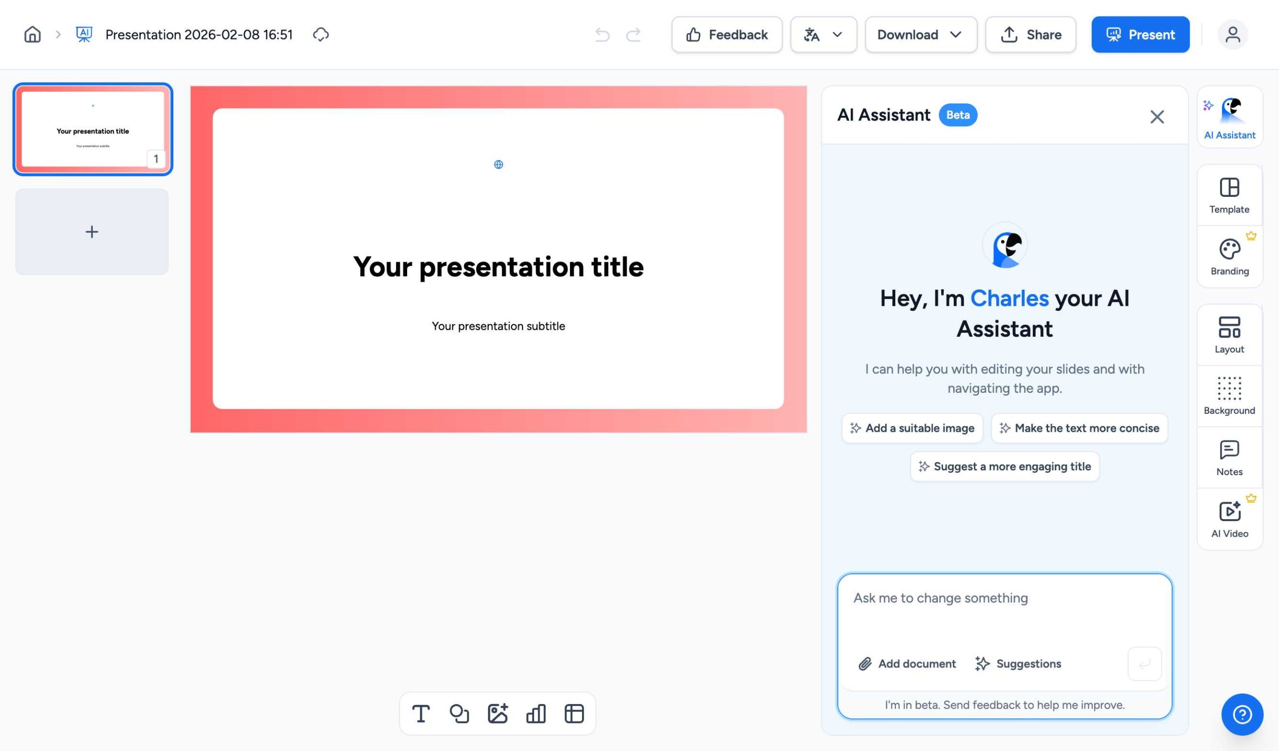
Method 2: Using the AI Assistant
You can also ask the AI Assistant to create charts for you. Simply describe what kind of chart you want, and the AI will generate it automatically.
Step 1: Open the AI Assistant
Click on the AI Assistant button in the right panel. You’ll see a text input where you can type your request.
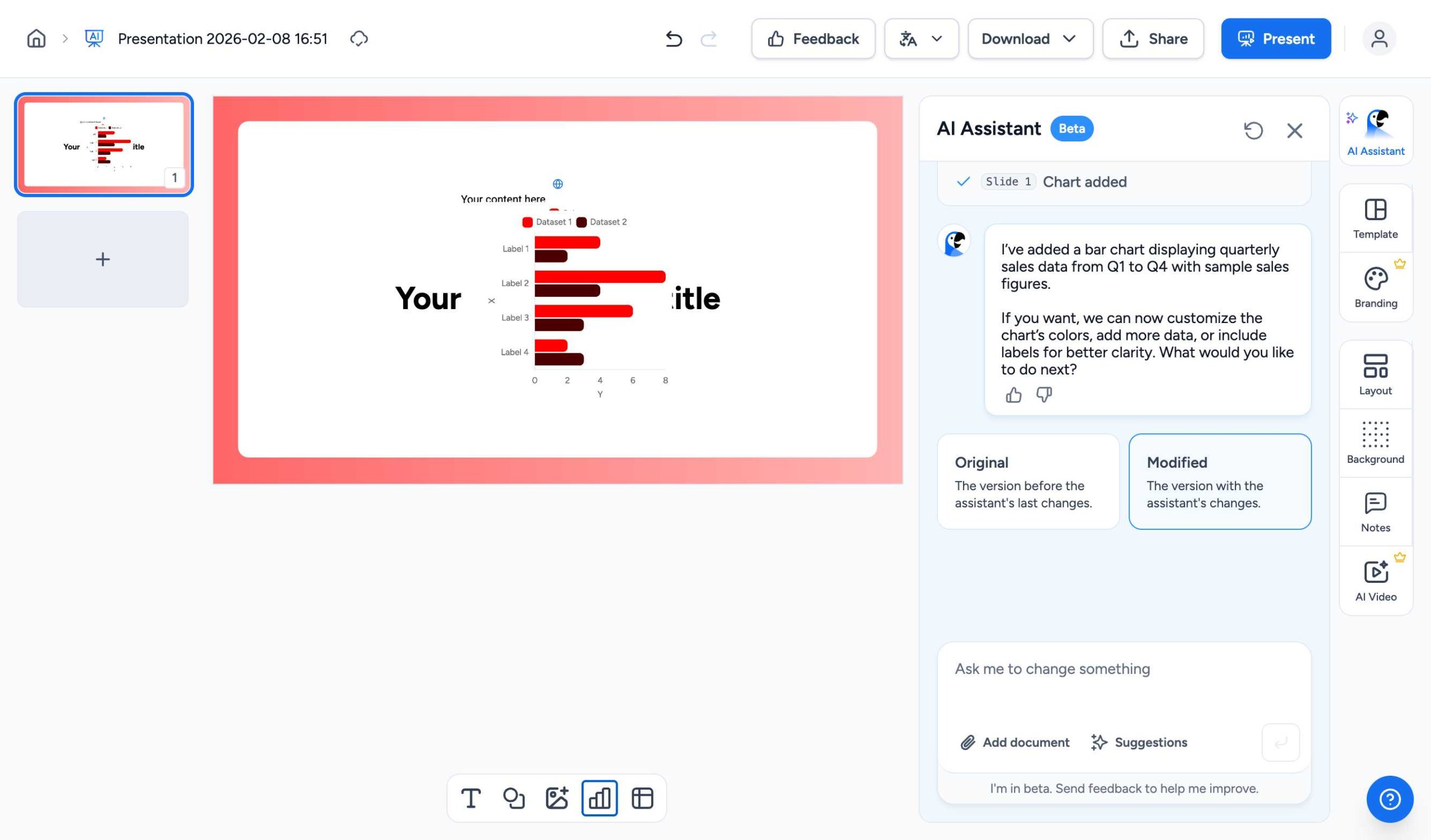
Step 2: Describe the chart you want
Type a request like “Add a bar chart showing quarterly sales data” or “Create a pie chart of market share percentages”. The AI will understand your request and create an appropriate chart.
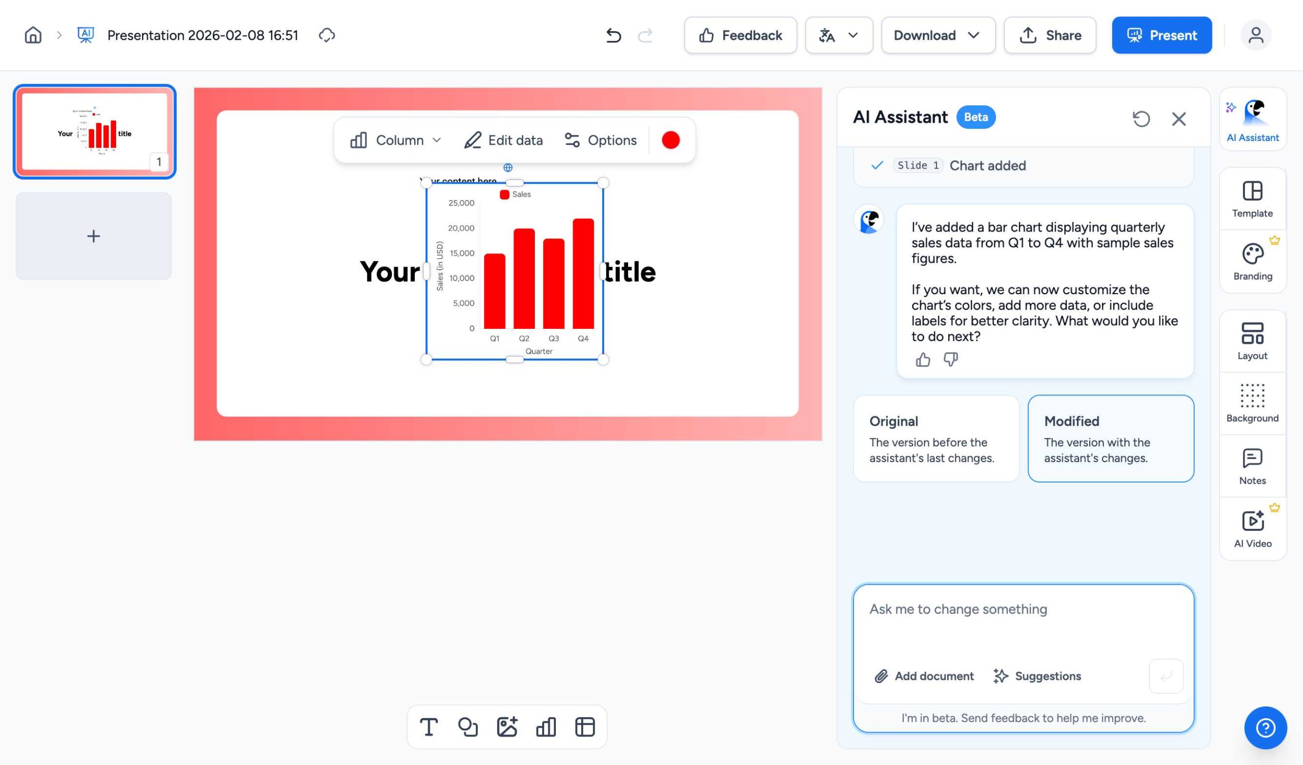
Step 3: Review and customize
The AI will add the chart to your slide. You can then click on the chart to customize it further – change the data, colors, or chart type as needed.
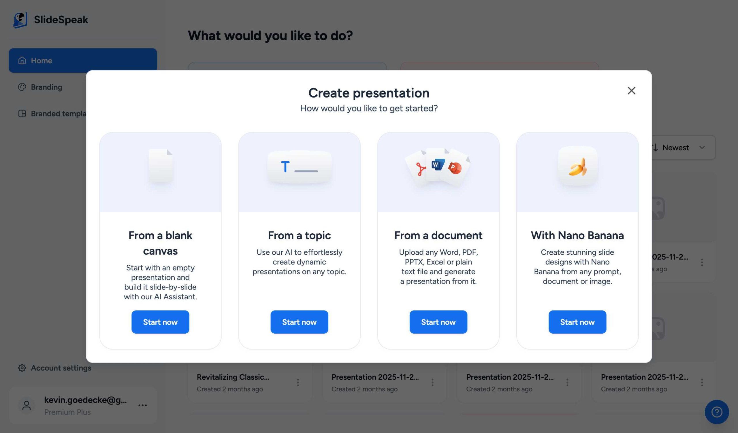
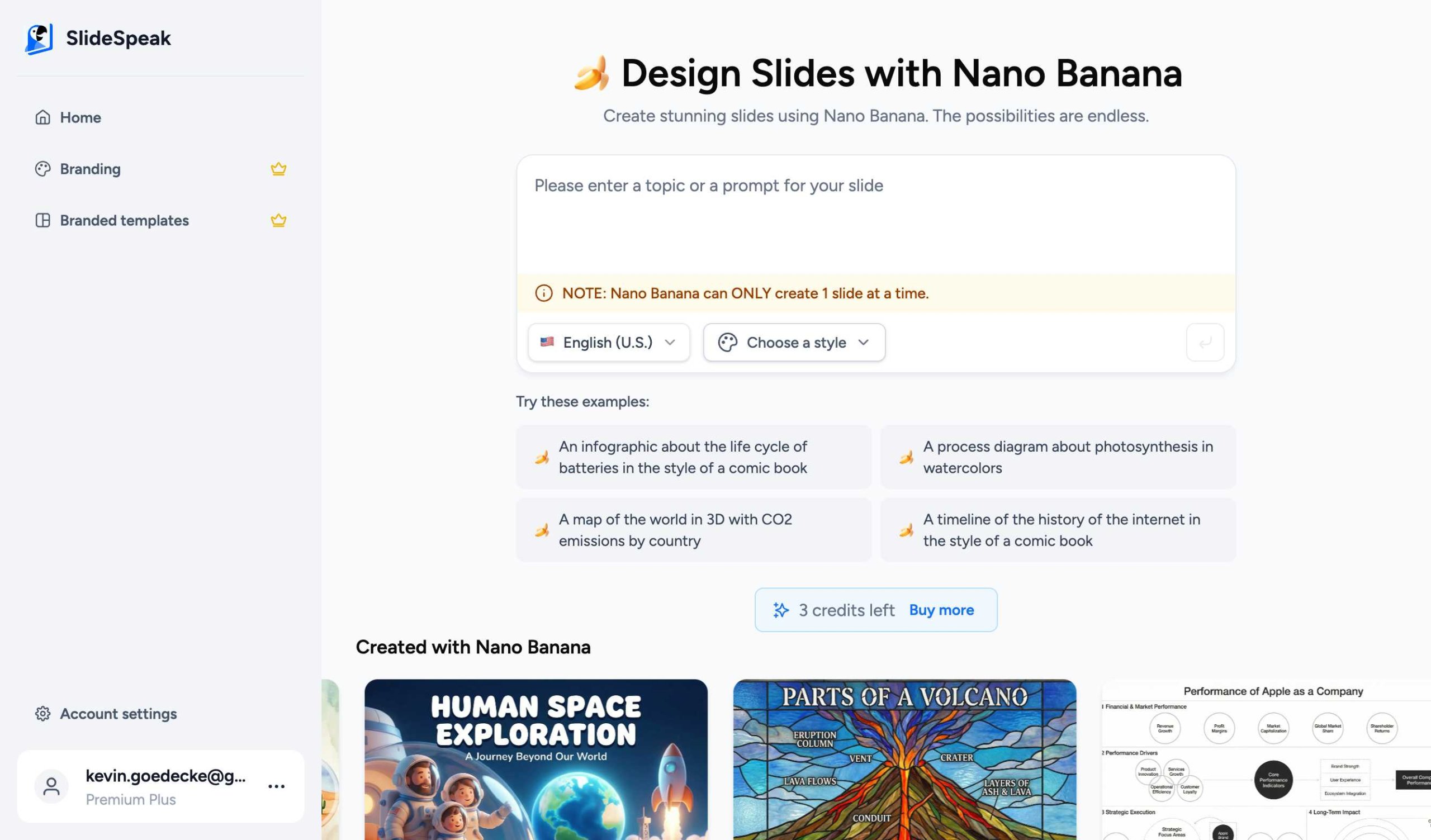
Method 3: Using Nano Banana for AI-Generated Infographics
Nano Banana is SlideSpeak’s advanced AI slide generator that can create beautiful infographics from a simple text description.
Step 1: Open Nano Banana
Click “Create presentation with AI” on the SlideSpeak dashboard, then select Nano Banana and click “Start now”.
Step 2: Enter Your Prompt
On the Nano Banana page, you can click one of the example prompts or write your own. For infographics, describe what data or information you want to visualize.
Step 3: Describe Your Infographic
Enter a detailed prompt describing your infographic. Be specific about the metrics, layout, and style you want. For example: “A professional infographic showing key business metrics: revenue growth, customer satisfaction, and market share with a clean corporate design”
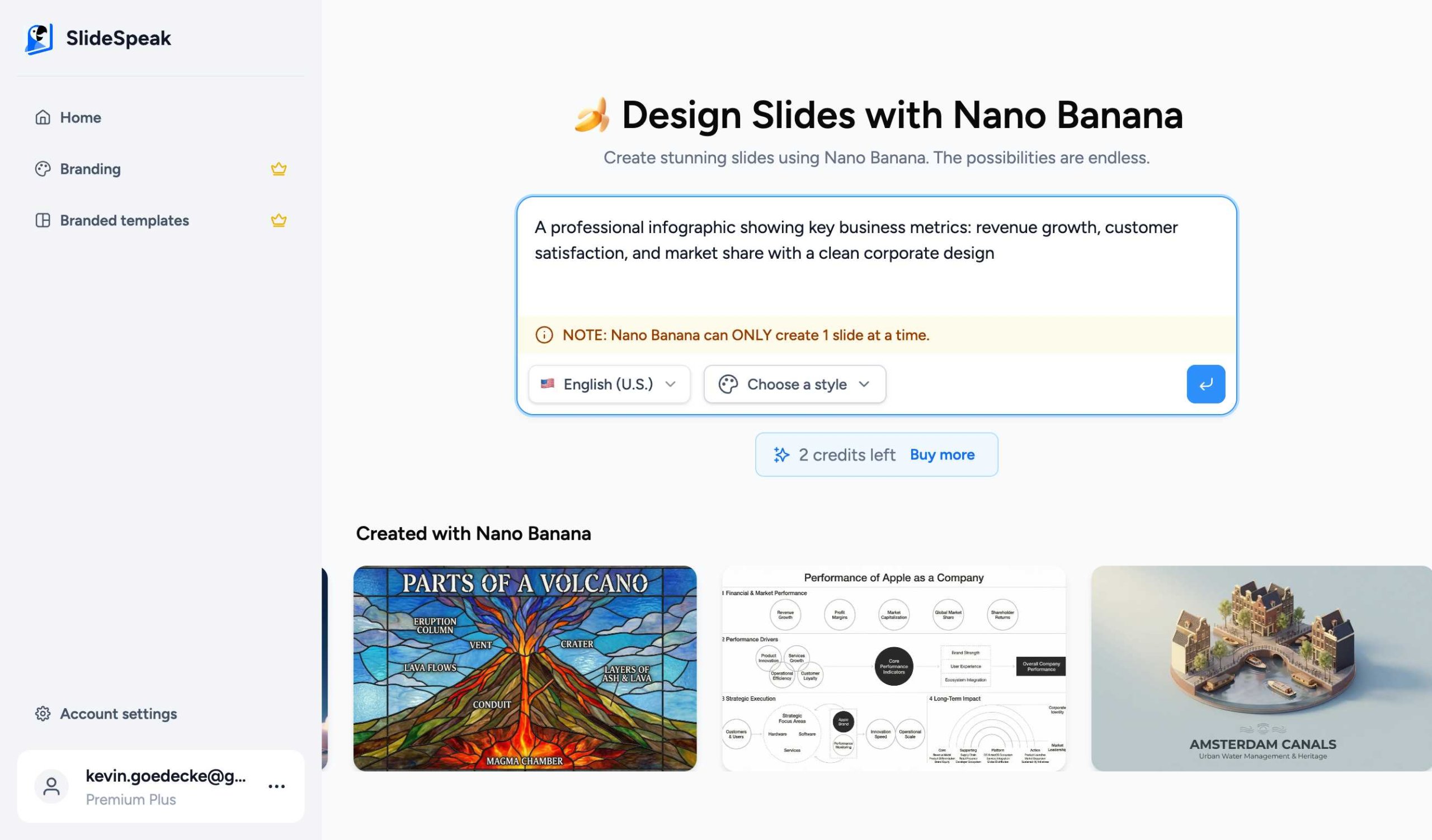
Step 4: Generate
Click Send and wait for Nano Banana to generate your infographic. This typically takes 2-4 minutes as the AI creates a custom design.
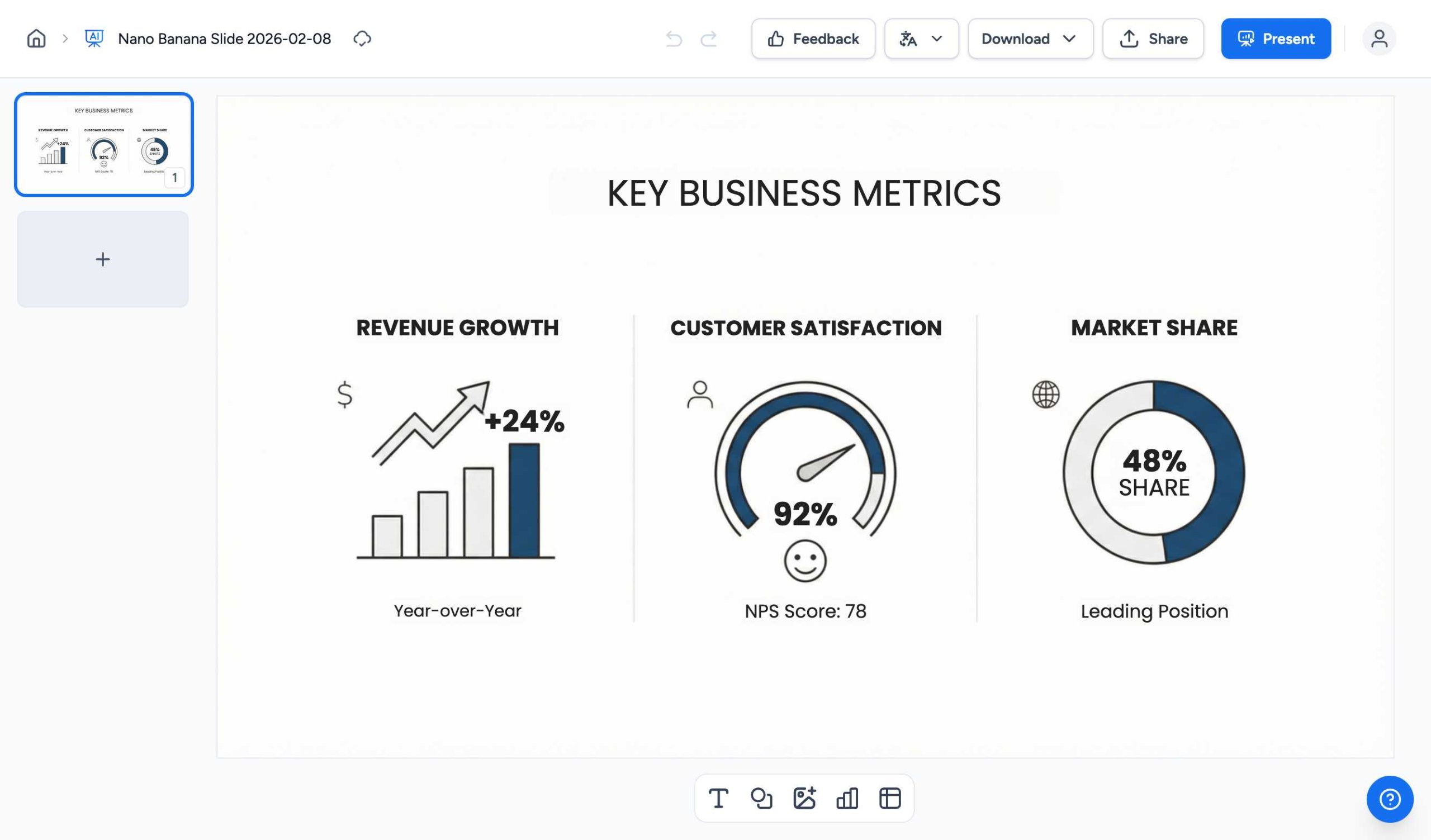
Step 5: View Your Infographic
Once complete, you’ll see your professional infographic ready to use! You can edit the text, download it, or share it directly.
Pro Tip: Nano Banana works best with detailed prompts. Include specific metrics, color preferences, or design styles for better results.
Tips for Great Charts & Infographics
- Keep your charts simple and easy to read
- Use consistent colors that match your presentation theme
- Add clear labels and titles to your charts
- Choose the right chart type for your data (e.g., pie charts for proportions, line charts for trends)
- Don’t overcrowd charts with too much data
💡 Pro tip: You can resize and reposition charts by clicking and dragging them on your slide.
Need more help?
If you have any questions or need assistance, feel free to contact our support team at support@slidespeak.co