
DESIGN.md for Presentations: Make AI Build On-Brand Slides
Written by
Published on
DESIGN.md is a small format with a big idea. Google Labs publishes the spec: one markdown file that tells AI coding agents how to build on-brand interfaces. Drop it into a coding agent like Claude, Cursor or Google Stitch, and the model designs to your system instead of guessing at colors and fonts. Teams beyond Google, Atlassian among them, keep one already. This post is about DESIGN.md for presentations: the same file, pointed at slides.
TLDR: Here’s a super extensive Github repo with Design.md for presentations.
Slide decks can use the same file, and almost no one does it yet. So this guide covers what a DESIGN.md is, what one looks like for a deck, and where to get 70 you can copy today.
What is a DESIGN.md file?
A DESIGN.md is a plain markdown file that describes a design system in a form an AI can follow. The official spec from Google Labs pairs machine-readable design tokens in a YAML header (hex codes, font names, spacing, corner radii) with markdown prose that explains why those values exist and how to apply them. Point an AI tool at the file and it builds to your brand instead of inventing a fresh look on every screen. The format is young, still at an alpha version, but the idea is simple enough to use now.
The reason it works is constraint. Give a model total freedom, and every output looks different. So fix the palette, the fonts and a short rule set, and the look holds steady while the model still does the hard parts: layout, hierarchy and balance. A design system exists to keep a product coherent, and a DESIGN.md is how you give one to a model.
The same idea works for slides
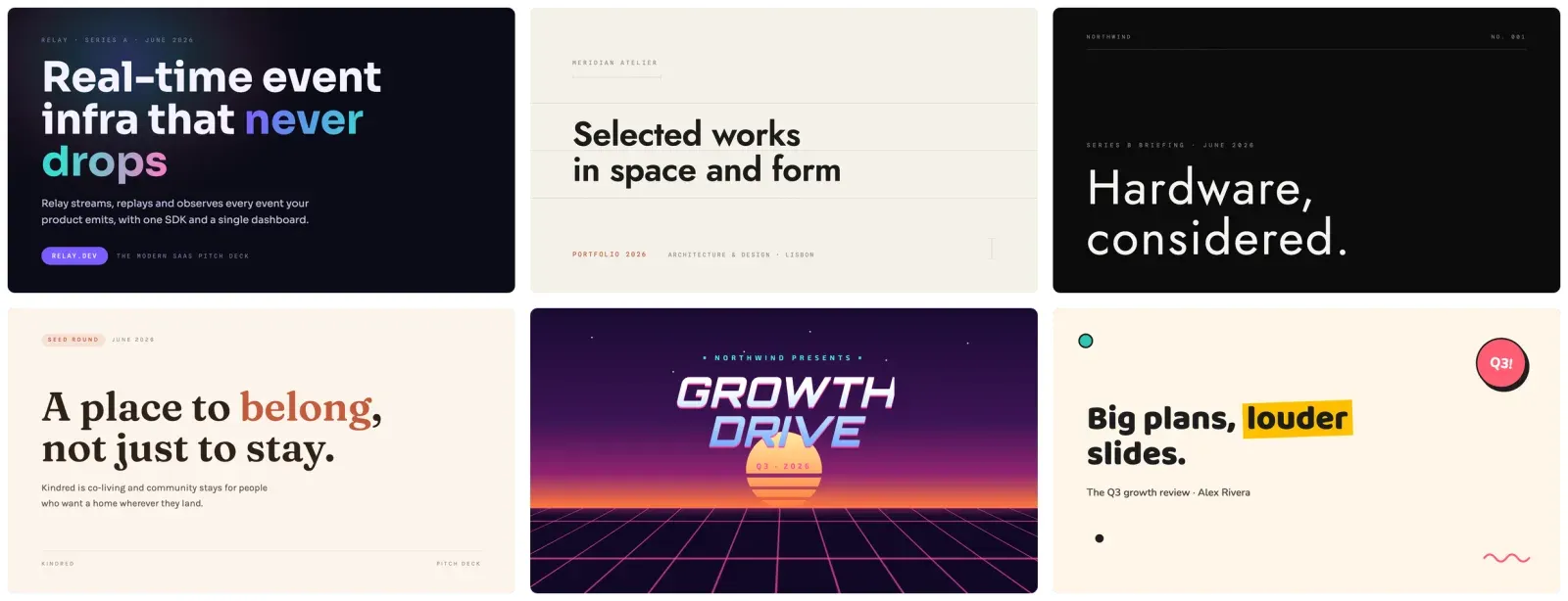
DESIGN.md grew up around web and app UI, and the format does not care what it styles. A deck is a design system too. It has a palette, a type pairing, a chart style, and a list of things a slide should never do. Write those down the same way and any AI that builds slides, whether ChatGPT, Claude or SlideSpeak, can hold one look across forty slides instead of drifting after the third.
Google’s DESIGN.md targets interfaces. This is the same concept aimed at presentations, not the official spec. In short, the payoff is identical: you stop re-describing your brand in every prompt and start handing the model a file.
Why your AI slides look generic
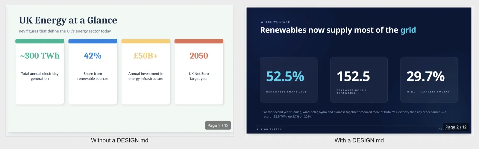
Ask any model for a deck with no design direction, and you get the same look every time: a soft drop shadow on every card, three or four accent colors competing, a stock icon beside each bullet, and rounded corners on everything. The model is averaging every slide it ever saw. The output is competent and forgettable.
A DESIGN.md removes those defaults. You name the two colors that carry the deck, the one font pairing, and the short list of moves the model should never make. The model still designs, only inside your lines. For example, run the same content through the same model twice, once with a design file and once without, and the gap is obvious on the first slide.
What goes in a DESIGN.md for presentations
A slide DESIGN.md is short, often a single paragraph. Six parts do the work:
- Background and surface colors, as exact hex values, so every slide sits on the same base.
- A two-font pairing, named so the model can load them. One for headings, one for body.
- One accent color with a job. Say where it goes (the key number, the active bar) and where it does not.
- A signature motif, the one repeating device that makes the deck recognizable, like an agenda tracker or a comparison matrix.
- A chart treatment: bar colors, label placement, and what to strip out.
- An avoid list, the rules that kill the generic AI deck look. No gradients, no drop shadows, no clip art.
The avoid list carries the most weight. Models default to soft shadows, three accent colors and stock icons. So naming what to skip removes that default in one line.
A presentation DESIGN.md, in full
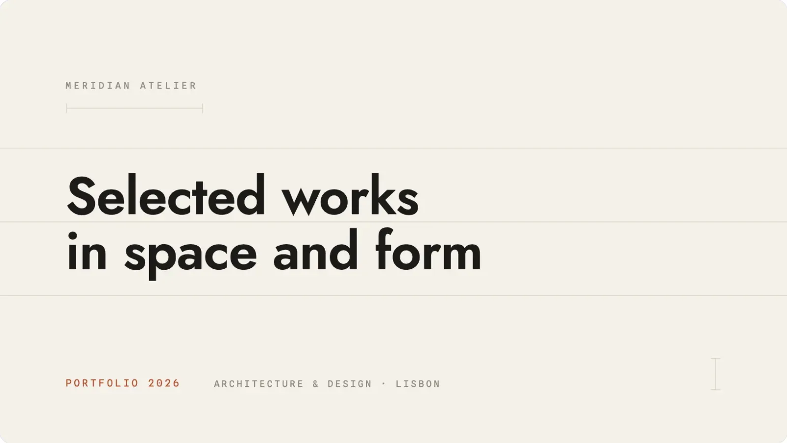
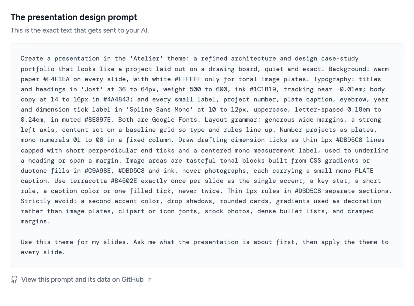
Here is a working example, the Atelier style from the SlideSpeak prompt library. It reads like a design spec because it is one: a paper background, a type pairing, a single terracotta accent used once per slide, a drafting-tick motif, and a long avoid list.
Create a presentation in the 'Atelier' theme: a refined architecture and design case-study portfolio that looks like a project laid out on a drawing board, quiet and exact. Background: warm paper #F4F1EA on every slide, with white #FFFFFF only for tonal image plates. Typography: titles and headings in 'Jost' at 36 to 64px, weight 500 to 600, ink #1C1B19, tracking near -0.01em; body copy at 14 to 16px in #4A4843; and every small label, project number, plate caption, eyebrow, year and dimension tick label in 'Spline Sans Mono' at 10 to 12px, uppercase, letter-spaced 0.18em to 0.24em, in muted #8E897E. Both are Google Fonts. Layout grammar: generous wide margins, a strong left axis, content set on a baseline grid so type and rules line up. Number projects as plates, mono numerals 01 to 06 in a fixed column. Draw drafting dimension ticks as thin 1px #DBD5C8 lines capped with short perpendicular end ticks and a centered mono measurement label, used to underline a heading or span a margin. Image areas are tasteful tonal blocks built from CSS gradients or duotone fills in #C9A98E, #DBD5C8 and ink, never photographs, each carrying a small mono PLATE caption. Use terracotta #B4502E exactly once per slide as the single accent, a key stat, a short rule, a caption color or one filled tick, never twice. Thin 1px rules in #DBD5C8 separate sections. Strictly avoid: a second accent color, drop shadows, rounded cards, gradients used as decoration rather than image plates, clipart or icon fonts, stock photos, dense bullet lists, and cramped margins.
Paste that into ChatGPT or Claude with your content and you get a calm, editorial portfolio deck, not a generic one. Open it in SlideSpeak and you export the same look to PowerPoint.
A bolder example: a brand deck
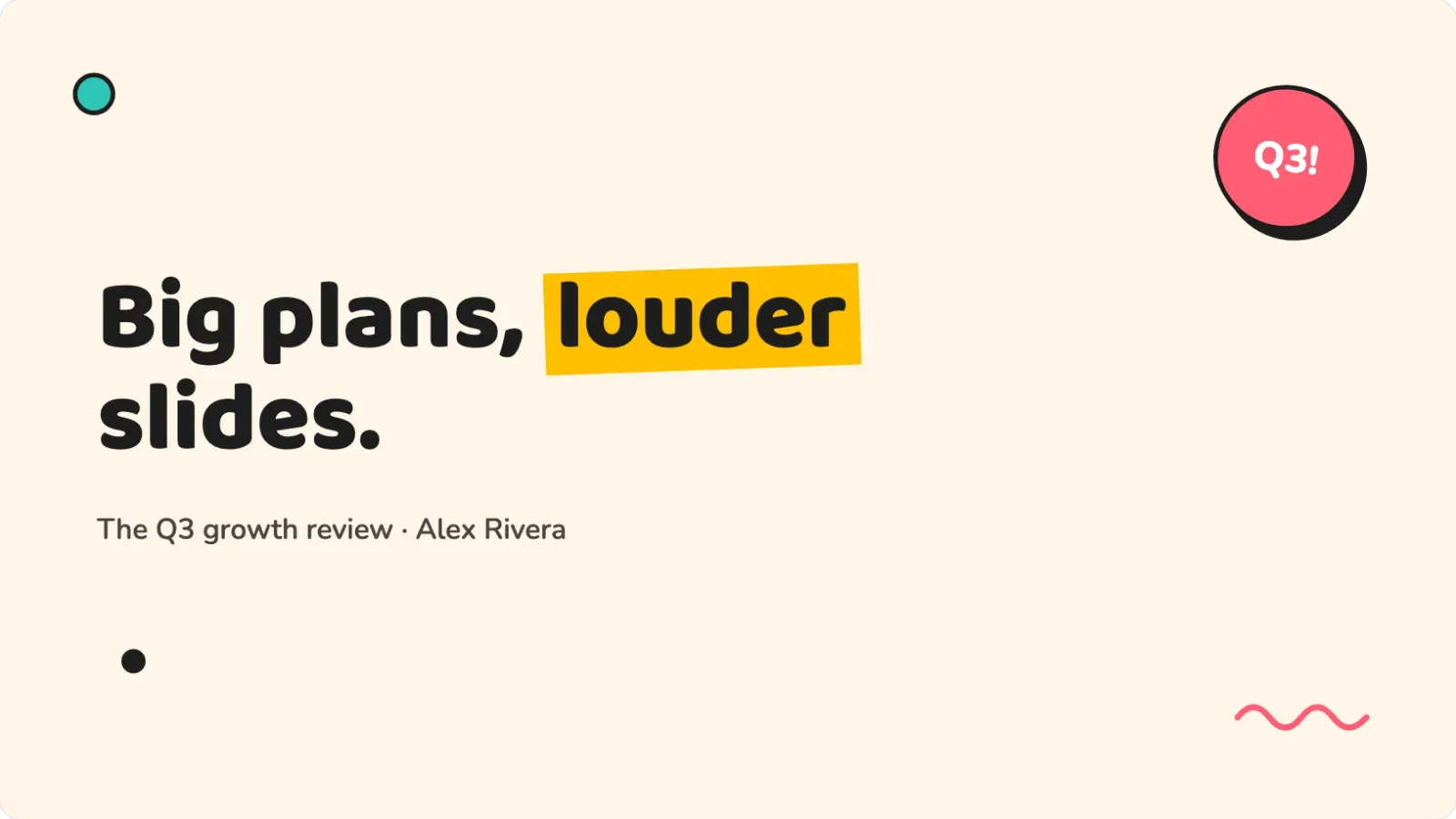
Atelier stays restrained on purpose. But the format handles loud just as well. Here is the Memphis style, a neo-brutalist look for marketing and brand decks, written as the same kind of file.
Create a presentation in Memphis design style, the 'Memphis' theme. Background: cream (#FFF6E9). Palette: pink-red (#FF5D73), teal (#2EC4B6), yellow (#FFBF00) and ink black (#1D1D1D). Every card, button and bar is a chunky block with a 3px solid black border, 8 to 12px corner radius, and a hard offset shadow: 6px right, 6px down, solid black, zero blur. Typography: headlines in chunky 'Baloo 2', body in 'Nunito' (both Google Fonts). Headlines: heavy weight, with exactly one word highlighted by a solid color rectangle rotated about minus 2 degrees sitting behind it like a marker stroke. Cards in lists alternate fill colors and rotate alternately about plus and minus 1 degree. Scatter a few small geometric confetti shapes (an outlined circle, a solid triangle, a zigzag squiggle) near corners, never behind text. Charts: color-filled bars with black outlines and offset shadows. Add one rotated circular sticker badge with a black border somewhere on the title slide. Strictly avoid: gradients, soft shadows, thin hairlines, muted colors, perfectly straight alignment.
Same structure, but opposite values. The avoid list still earns its place: it bans the soft shadows and muted colors that would water the style down, and it keeps the alignment deliberately off. A consulting deck and a brand deck share one format and disagree on every setting, which is the point of writing the file instead of hard-coding a single look.
How to use a DESIGN.md for your slides
Three steps take you from file to finished deck:
- Pick a style that fits your topic. Open the SlideSpeak prompt library and choose the one that matches.
- Copy its prompt. That block is your presentation DESIGN.md. Each one fixes the palette, fonts, motif and avoid list.
- Paste it into ChatGPT or Claude with your content, or build and export the deck in SlideSpeak as PowerPoint or PDF.
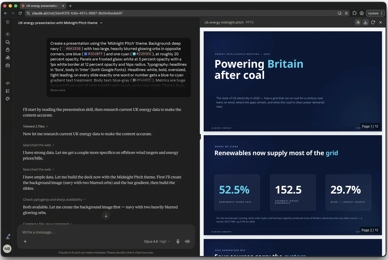
A DESIGN.md is the manual route: you paste it in for each new deck. To skip the pasting, SlideSpeak Onbrand gives Claude, Codex, Cursor and other MCP clients direct access to your logos, colors, fonts and approved slide layouts, so every deck an agent builds comes out on brand without a prompt.
How to write your own DESIGN.md, step by step
You can write your own in about ten minutes. So build it one line at a time from the six parts above, then test it on a single slide before you trust it with a deck.
- Set the base. Name your background and surface colors as hex. Start with
Background: #FFFFFF. Cards and panels: #F5F7FA.Every slide now sits on the same ground. - Pick two fonts. One for headings, one for body, both named so the model can load them:
Headings in 'Inter' bold, body in 'Inter' regular (a Google Font).One typeface in two weights is a safe default. - Choose one accent and give it a job.
Accent #2563EB on the key number, the active chart bar, and links. Nowhere else.The job is what stops the model spraying the color across the slide. - Name a signature motif. The one device a reader remembers:
Each section opens with a large numeral in the accent color and a thin rule beneath the title.Pick something the model can repeat on every slide. - Set the chart rule.
Charts: bars in light gray, the key bar in the accent, values labeled directly, no gridlines or legend.Charts are where decks drift most, so this line pays off fast. - Write the avoid list last and longest.
Strictly avoid: gradients, drop shadows, more than two accent colors, clip-art icons, rounded corners above 4px, full-sentence bullets.List every default you have watched the model reach for.
Paste the finished block into ChatGPT, Claude or SlideSpeak with one slide of content, and read the result against your avoid list. Then tighten any line the model ignored and run a full deck. Save the file and reuse it on every deck after that.
Five presentation DESIGN.md files to copy
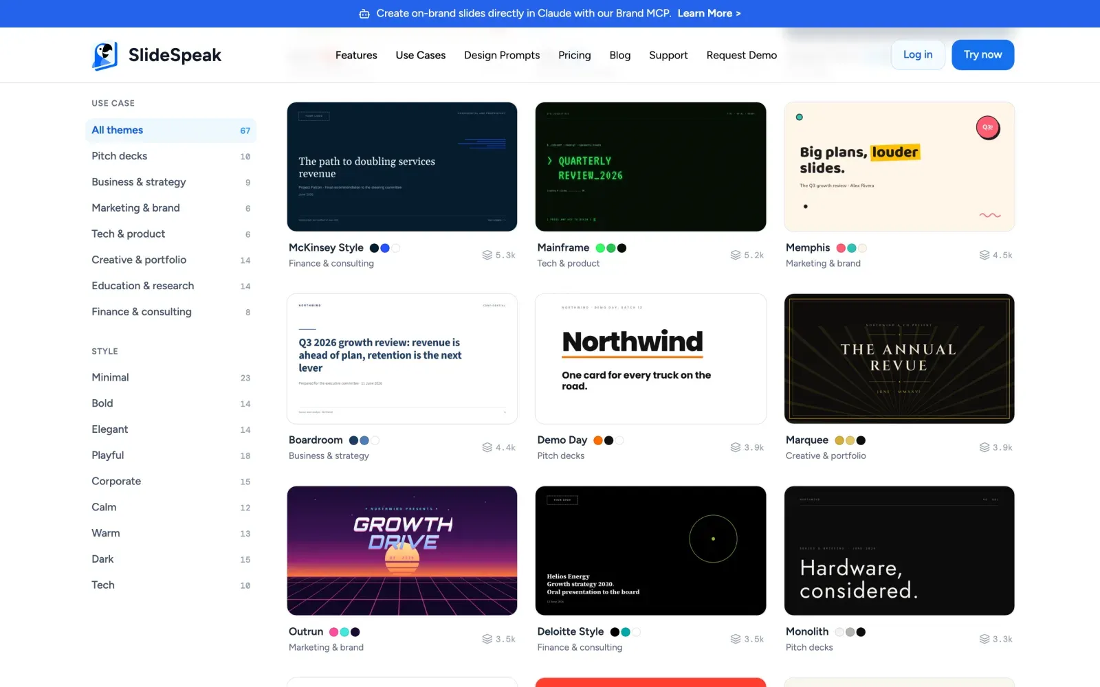
The library holds 70 of these across pitch, business, marketing, tech, creative, education and finance. Five to start with:
- Atelier: warm-paper editorial portfolio with one terracotta accent and drafting-tick detailing. Built for design and creative case studies.
- Monolith: near-black luxury minimalism with huge thin type and acres of empty space. Built for premium product and brand reveals.
- Memphis: chunky blocks, hard offset shadows and confetti shapes. Built for playful brand decks.
- Hearth: soft cream, a warm serif, and one clay accent per slide. Built for story-led pitch decks.
- Boardroom: navy strategy-consulting look with action titles and a 2×2 matrix. Built for board papers and reviews.
Every prompt is free for personal and commercial work. Browse the full set in the presentation design library, or jump to a category like business and strategy or pitch decks.
DESIGN.md for slides vs DESIGN.md for code
The file is the same idea in both places. The contents differ:
| Aspect | DESIGN.md for code | DESIGN.md for presentations |
|---|---|---|
| What it styles | Web and app interfaces | Slide decks |
| Who reads it | Coding agents (Claude, Cursor, Stitch) | ChatGPT, Claude, SlideSpeak |
| Core tokens | Colors, type, spacing, radii, components | Colors, type, chart style, signature motif |
| Main rules | Component usage, states, responsive layout | Title style, one idea per slide, the avoid list |
| Output | A built screen | A finished deck |
If you already keep a DESIGN.md for your app, you know the workflow. A DESIGN.md for presentations is shorter and skips components, but the discipline matches: tokens, rules, and a list of what to avoid.
DESIGN.md FAQ
What is a DESIGN.md file?
A DESIGN.md is a markdown file that describes a design system for an AI to follow. It pairs design tokens in a YAML header (hex colors, fonts, spacing) with markdown rules, so a model builds to your brand instead of guessing. Google Labs publishes the spec, which is hosted via Google Stitch, licensed Apache-2.0, and currently at an alpha version.
Can I use a DESIGN.md for presentations?
Yes. A deck has a palette, fonts, a chart style and rules, the same things a DESIGN.md captures for UI. Write them in one markdown block and ChatGPT, Claude or SlideSpeak can apply the look across a whole deck.
How do I write a DESIGN.md for slides?
Name your background and surface colors as hex values, a two-font pairing, one accent color with a job, a signature motif, a chart treatment, and an avoid list. Keep it to one paragraph. The avoid list, such as no gradients and no drop shadows, does the most work.
Why do my AI-generated slides look generic?
With no design direction, a model falls back to its averages: soft shadows, several accent colors, stock icons and rounded corners on everything. A DESIGN.md removes those defaults by fixing your colors, fonts and an avoid list, so the model designs inside your brand instead of its own.
Does a DESIGN.md work with ChatGPT and Claude?
Yes. Both read the file as part of your prompt and design to it. Paste the markdown above your content, or load it as a project file so every new deck starts on-brand.
DESIGN.md vs CLAUDE.md: what is the difference?
CLAUDE.md tells a coding agent how to work in your repo: commands, conventions and tests. DESIGN.md tells it how things should look: colors, type and rules. One governs behavior, the other governs design. A presentation DESIGN.md is the design half, aimed at slides.
Are the SlideSpeak presentation prompts free?
Yes. All 70 in the library are free to copy for personal and commercial work, in ChatGPT, Claude or SlideSpeak.
Stop re-describing your brand
Every time you prompt an AI for a slide, you spell out your colors and fonts again. Write them once as a DESIGN.md, or copy one from the SlideSpeak library, and your next deck starts on-brand. Build it in SlideSpeak and export to PowerPoint or PDF.


